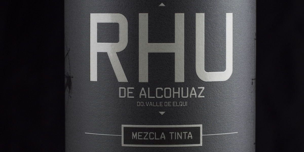
A delicious wine with a sacred symbol. RHU Mezcla Tinta is a divine way to wind down at the end of the day. Designed by GRAFIKART, the black and silver packaging piques interest while splashes of blue brighten up the overall look. The symbols appear black on black, and you’ll almost miss them if you don’t look closely enough.
“This symbol has been named in many ways and appears in various cultures, among those names, RHU; it is the meeting point of two circles, two arcs enclosing a space and opening a portal, the first step between divine and terrestrial, the matrix of duality. This symbol is a portal between the non visible and the visible. The wine is the visible expression of these pristine energies. The design was created and produced by Edward Pearson for Viñedos de Alcohuaz in the Elqui Valley.”
Designed by: GRAFIKART