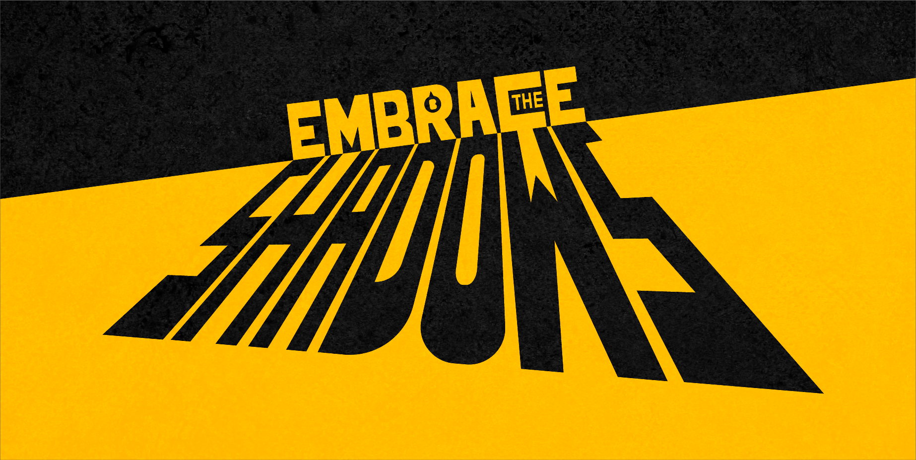
Embracing the Shadows: How Brands Explore the Darker Side of Brand Identity
By
Published
Filed under
By
Published
Filed under
Brands are starting to explore the darker, more uncomfortable side of their personalities in order to be more distinctive and believable to consumers. Ed Silk, Bulletproof’s strategy director, explains:
Over the last 35 years, the branding world has undergone a revolution. The once false, perma-smile perfection of beautiful people beaming at us from a fabricated place where the sun always shines and everyone is happy has been trumped by a darker, realistic, if more uncomfortable, truth. This truth is manifested in all corners of our culture – from the products we use to the docudramas we watch.
Brands are now toying with and exploring the darker side of their identity in order to be more distinctive, relevant and believable. Traditional notions of beauty have been subverted, imperfections are being celebrated, the taboo is becoming permissible. What was once deemed ugly, undesirable and unacceptable is now being used as a means of unlocking emotion and empathy in a way that consumers may truly relate.
Get unlimited access to latest industry news, 27,000+ articles and case studies.
Have an account? Sign in