Featured image for William Grant & Sons Wood's Old Navy Rum

William Grant & Sons Wood's Old Navy Rum

by Theresa Christine Johnson on 04/25/2016 | 4 Minute Read

Editorial photograph

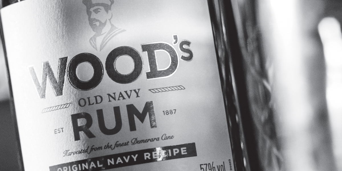
Ask any bartender or rum drinker, and they’ve heard of Wood’s Old Navy Rum. With over 100 years, William Grant & Sons has distributed this highly revered spirit. However, the packaging felt dated and possessed limited shelf appeal, so they turned to Purple Creative for new premium packaging.

Gwilym Cooke, Wood’s Brand Manager, comments, “After evaluating the brand’s rich history, consumer trends and the dark rum category, we recognised an opportunity to rejuvenate Wood’s. Purple has succeeded in creating premium packaging that matches the quality of the liquid inside the bottle, without straying from the navy history that is so iconic to the brand.”

Editorial photograph

Purple Creative Founding Partner & Creative Director, Steve Bewick, mentions, “Our objective was to make the Wood’s bottle and packaging more premium, iconic and memorable. We conducted extensive research into the history and heritage of Wood’s, including unearthing some previously unknown facts about the brand inspired by its rich naval heritage and traditions.”

Editorial photograph

“We gave the Wood’s bottle an overhaul – a stronger, sturdier bottle with thicker glass to represent the strength of the liquid (57% ABV) and the toughness of sailors in the British Navy in the eighteenth century when they were given their daily ration of rum. We added a cork to make it more premium and more authentic, as original bottles on board would have had corks.”

“We transformed the pastel illustration of the sailor from the old bottle, into a bolder and more iconic image, strong enough to stand alone as part of the Wood’s brand identity. It is now a more realistic representation of an able seaman in and around the early 1900s (beards were allowed!). Aboard old British Navy ships, ‘splicing the mainbrace’ was the exhausting job of intertwining thick hemp to repair the mast’s main rigging – only the strongest able seamen were chosen to perform it. As a reward for a job well done, each sailor involved was issued with an extra ration of navy rum. Inspired by this tradition, we have incorporated subtle rope embellishments into the design. We took inspiration from naval uniforms of the time, especially the stripes on the lapels, to create a simple but bold graphic device that can be used on communications to create a recognisable look and feel. Like the language on board ship, the brand’s tone of voice is bold, honest and straightforward.”

Editorial photograph

Wood’s Old Navy Rum can easily compete with the new artisan spirits of today, but consumers will surely appreciate their rich history and dedication to keeping their recipe alive. The logo has been cleaned up and definitely adopts the idea that “less is more.” The font choice has changed slightly so it’s still recognizable but has a much more modern appeal. By removing some of the colors, especially in the logo, consumers are more able to notice the dark and alluring hue of the rum.

Editorial photograph

“The recipe has never changed—it was created in 1887 and is still made to the original navy recipe. It uses rum from the world’s only single wooden pot still—up to 250 years old, the still is made of greenheart, a local hardwood that imparts complex flavours. It’s the only Demerara rum still bottled at 57% ABV—the minimum strength of rums originally served on board British Navy ships, which had to be ‘proved’ to its sailors before having water added. Demerara rum—a blend of three Guyana rums made from Demerara black strap molasses. Warm, bold & unique taste—rich punchy notes of brown sugar, Christmas pudding and thick syrupy toffee.”

Editorial photograph

Designed by: Purple Creative

Country: United Kingdom

City: London