

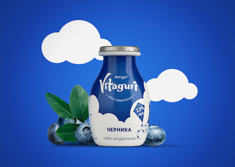
Moms are always concerned about the health and well-being of their families, and Vitagurt makes giving them healthy and organic food even easier. Designed by Irina Hasselbusch, these convenient to-go bottles and easy-to-pack containers make it easy to have delicious and natural yogurt anywhere.
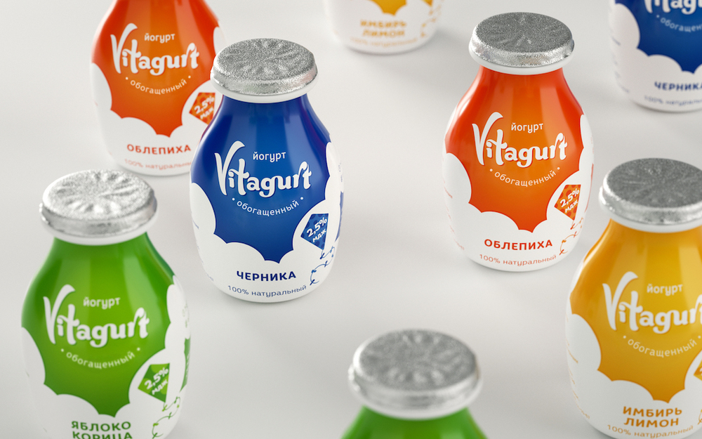

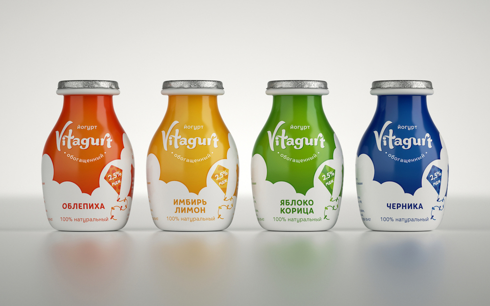

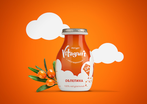
Using the actual product—Greek yogurt—as inspiration for the branding and packaging, we see light and fluffy clouds floating around the colors that indicate each flavor. A kite flies among the clouds, giving us a carefree and positive attitude. The font choice is fun and can easily get children excited about eating Greek yogurt but it’s equally suitable for adults, making Vitagurt a wonderful choice for the whole family.

“The client asked for a lightsome and positive identity that will help him to target mothers who care about natural ingredients and choose the best products for their families. This project began with a search for a name that reflects organic quality of the product. We decided to go with an ineVITAble the Latin word ‘vita’ (life). Vita + yogurt = Vitagurt.”
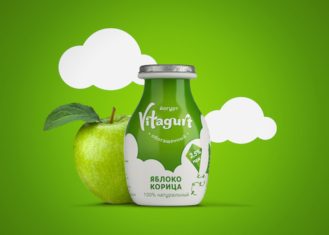
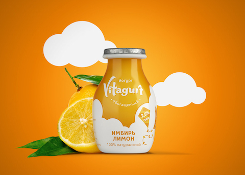
“Greek yogurt is extremely soft yet holds its shape even when you spoon it out. In a way, it reminds a cloud. I followed the idea of softness, airiness and tenderness of a truly natural thing and came up with the whole cloud-on-a spoon concept that was inspired by the product itself. In order to position the brand away from competitors we decided not to use an image of fruits and berries popular in the yogurt market. To keep things simple, yet still emotional, I stick to plain shapes and clean colours. Each flavour associates with a different colour and different type of pattern placed on a small kite next to the logo. Typographic smile under the logo was a final touch that adds to a brand’s friendliness.”

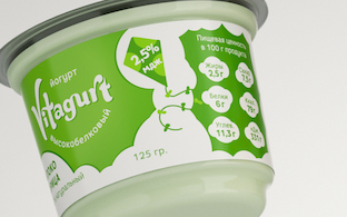
“Packaging was another important part of the project: I created a bellied-shaped container for drinking yogurt. It conveniently fits into a hand, purse or a school bag, at the same time holds enough tasty yogurt for a healthy snack on the go.”

Designed by: Irina Hasselbusch
Client: Food Production
Country: United Kingdom
City: London


