Concepts We Wish Were Real

Published

It’s that time of the week! Time to kick back, relax and enjoy today’s concepts we wish were real.
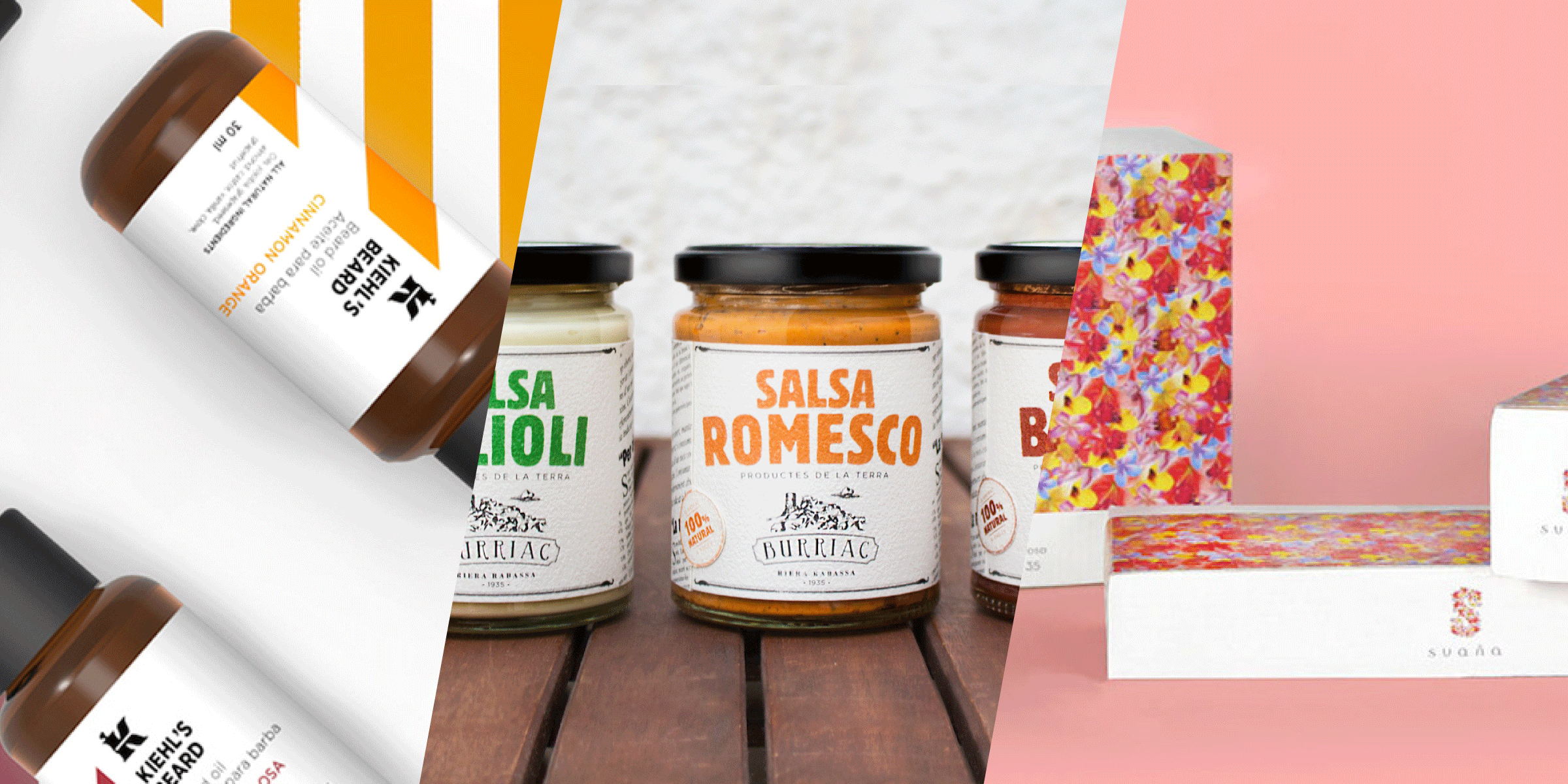

BURRIAC SAUCES

Student

Dinner just got more interesting. This tasty line of sauces is a student project by Albert Pablo that would bring the taste of Spain to a bigger audience. For the packaging, Pablo took inspiration from the way the main sauce is traditionally consumed for a unique look.

“This project is about the creation of a new packaging family for sauces, typical from Catalonia. The main product is the Romesco sauce. Here we eat it with ‘calçots.’ a type of onion also typical from here. It’s really common to bring the calçots to the table rolled in a newspaper. This is the point that I tried to push really hard on these packs, where all the information is structured like a newspaper, and all the typography and the composition translate us to the beginning of the XX’s, the period when Romesco sauce appeared.”

The label features all of the usual information you’ll find, like the ingredients and nutritional information, but it is presented as a newspaper clipping. It’s an approach that is unexpected, fun, and also feels like more of an interactive experience for the consumer. Instead of the way they normally see this information, it’s almost like they’re searching through the classifieds or the front page to learn more about the product. The clear jar allows buyers to see the sauces, and the hues of each one are matched or complemented by the text color on the label. Burriac Sauces’ logo features a bit of the landscape of the region, helping to transport buyers to the northeast part of Spain with their food. 

Designed by Albert Pablo

Country: Spai


Kiehl’s Beard

Student

Gentleman, beard oil is your beard’s best friend. If you find that your beard makes your skin itchy or dry, then these nourishing oils and other products will come to the rescue. A concept fromMaria Babia and Maria Romero, two students at ElisavaPack, this line of facial hair and skincare includes beard shampoo, oil, and even mustache wax. Using an old barber shop pole as inspiration, the packaging features slanted lines in various colors. The hues are rich and give a bit of an updated look to the retro barber shop idea, while also acting as an indicator of the scents. Goldenrod perfectly suits the cinnamon orange, while a minty green is for the tea tree variety. The sans serif font looks incredibly contemporary, further modernizing the idea of the product line.  

Designed by Maria BabiaMaria Romero

Country: Spain


Chocolate Lover’s

Student

I’m a firm believer that you can’t really go wrong with chocolate. If you agree, then you’ll be intrigued by the delicious flavors of milk chocolate in the Chocolate Lovers line. A concept from Jeremy Lebon, each bar has its own pastel color and design. Maybe you’ll be tempted to grab a bar of your favorite flavor, or maybe you’ll just want to try all of the mouthwatering options. 

Chocolate Lovers comes in flavors like kiwi and banana, which are more unusual flavors to find in a chocolate bar. The light, dreamy hues create a lovely color palette, while the different rectangular designs on each flavor add a bit of variety. “Chocolate Lovers” is written in two fonts that work wonderfully together—a tall sans serif and a slightly slanted script. The combination is refreshing and feels modern, encouraging those who love chocolate to try something slightly more adventurous with their sweets.

Designed by Jeremy Lebon

Country: France


SAUÑA COSMETICS

Student

“A promise for passion.” This adorable concept for Sauña Cosmetics is playful and irresistibly feminine. Designed by Christiana Theophanopoulos, it brings Argentinian skincare to those wanting radiant, naturally beautiful skin. 

“Suaña is an all-natural, sustainable Argentinian cosmetics brand exclusively sold at Bergdorf Goodman. Targeted to young women, this is a series of packages designed for a lipstick, a powder and an eye-shadow. The vibrant floral pattern that covers the outer package is composed of flowers that are indigenous to Argentina’s rainforest and the paper stock used is recycled. Suaña takes a new approach to eco-friendly design as the brand’s color and tone differ from other brands on the market. It rises from the tropical rainforest to make your skin radiate with an exotic glow.”

The floral pattern is an updated and more saturated take on more traditional flowery designs that we often see on cosmetics. Instead of dainty, delicate fauna, we see an overload of bright pink, golden yellow, and sky blue. This bold approach speaks to young women who want their skincare to make them stand out from the crowd. Against the white, the floral design instantly pops, and the modern and unusual font choice communicates that Sauña Cosmetics is better than the typical drugstore skincare.

Designed by Christiana Theophanopoulos

Country: United States


Origin

Concept

Love coffee? Then you’ll love the unique coffee beans Origin offers. Designed by Marina Porte, the branding and packaging is influenced by the location from which the beans are sourced. 

“Jamaican Coffee or Jamaica Blue Mountain Coffee is a classification of coffee grown in the Blue Mountains of Jamaica. The best lots of Blue Mountain coffee are noted for their mild flavour and lack of bitterness. Over the past few decades, this coffee has developed a reputation that has made it one of the most expensive and sought-after coffees in the world. Over 80% of all Jamaican Blue Mountain Coffee is exported to Japan. In addition to its use for brewed coffee, the beans are the flavor base of Tia Maria coffee liqueur.”

Lines, like that of a topographical map, run along the packaging and add a delightful texture to Origin. Bronze accents shine against the black background and add a bit of mystery and seriousness to the brand, indicating that they simply want to provide the best coffee possible. Origin is perfect for those who love getting their caffeine fix but are interested in a unique flavor and coffee that comes from intriguing places.

Designed by Marina Porte

Country: Spain


TRÄKOL MEN’S SKIN CARE

Student

Men’s skin is quite different from women’s. The same products that help to clean and moisturize a woman’s skin can cause breakouts or fail to hydrate men’s skin. Träkol Men’s Skin Care is a concept designed byMeg Yoder to provide men with natural skincare products that are effective and designed just for them. 

“Harnessing the power of charcoal and chocolate, Träkol skin care products for men are made in the USA using natural ingredients. The package design reinforces the durability and strength of charcoal through dark paper tones and a variety of sturdy materials including glass, metal, and cardstock. Specialized ingredient lists and recycled packaging against black product appeal to the conscientious consumer.”

Taking charcoal and chocolate as influences, it only makes sense for Träkol to have a darker, moodier appearance than typical skincare lines. The black and gray, combined with gunmetal lids and thick stamps on each product, give Träkol Men’s Skin Care a rugged and more masculine appearance. The products are natural and 100% vegan, making it an appealing choice to those who want effective products that are also good for them. Simple font choices and the lack of graphics on the packaging gives it a minimalist appearance in a way we don’t see too often—instead of clean, white packs, Träkol possesses that darker, more masculine look but also indicates the fresh and natural ingredients.

Designed by Meg Yoder

Country: United States


This placeholder is removed when the ad slot is configured.

This placeholder is removed when the ad slot is configured.

This placeholder is removed when the ad slot is configured.

This placeholder is removed when the ad slot is configured.

This placeholder is removed when the ad slot is configured.

This placeholder is removed when the ad slot is configured.