Featured image for Lynx

Lynx

by Theresa Christine Johnson on 04/05/2016 | 3 Minute Read

Editorial photograph

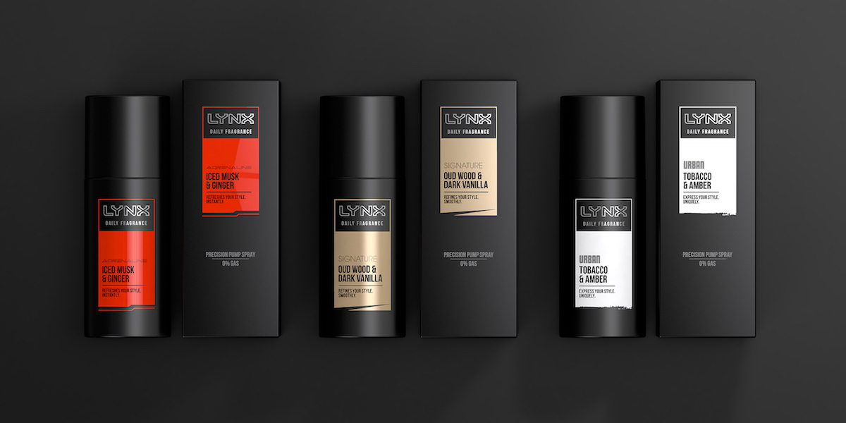
You may know it as Axe body spray, but in the UK it’s referred to as Lynx. This line of male grooming products, including fragrances, body washes, and hair styling items, has undergone a transformation led by London agency PB Creative.

“The brand refresh was introduced via a ground-breaking advertising campaign, ‘Find Your Magic’, in February this year. Brand design, packaging and visual identity were all developed by branding and packaging consultancy PB Creative.”

“Prior to the repositioning, Lynx products and their accompanying marketing campaigns were targeted firmly towards a young male demographic, with brand messages revolving around traditional ideas of masculinity, desirability and attraction. Following extensive research, Lynx’s new positioning features a radical, progressive point of view on masculinity and attractiveness, focused on allowing guys to find their own individual style and inspiration.”

Fernando Desouches, Global Brand Director for Axe (Lynx), mentions, “We’re living in an era of unprecedented freedom and acceptance — and yet what we’ve seen is that a lot of men still feel huge pressure to look and behave a certain way in order to be seen as attractive.”

“PB Creative has been instrumental in the brand refresh, developing a new brandmark and updating the brand’s base range of products, including new icons for its 40+ fragrance variants. The agency has also created the branding and packaging for Lynx’s new premium range, which extends the brand into the more aspirational male grooming market."

Ben Lambert, co-founder and creative director at PB Creative, explains, “Men in general and their attitude towards male grooming in particular have changed massively in recent years. Traditional notions of masculinity are simply no longer relevant, and with such a rapidly changing audience, it was vital for the Lynx brand to change as well. The new designs reflect this sense of a brand growing up with its audience.”

Lynx’s new look delivers bold colors with a modern typographic approach to help consumers navigate their line of products. Against black packaging, the colors stand out expressing a sharp confidence. The products elicit strength in a less traditionally masculine way and appeal to men desiring a more self-assured attitude.

“The new Lynx brandmark has been updated to a consistent horizontal approach and uses a single minded silver key-line that communicates understated confidence and a new premium look.”

“It was important for the brand that both the base range and premium line retained a degree of its iconic personality on pack. The base range distilled the variant character through a new iconic approach that moved away from the overly expressive graphics to a look that allowed the brand to ‘own black’ again whilst still allowing the consumer to find the fragrance variant that they love. For the first time this was consistently rolled out across all touch points and categories to create a globally unified proposition.”

“The new premium range celebrates individuality and sophistication delivered through three male archetypes – Signature, Urban and Adrenaline. A guy can exclusively embody a single archetype or change his look and according to mood or occasion.”

Editorial photograph

Designed by: PB Creative

Country: United Kingdom

City: London