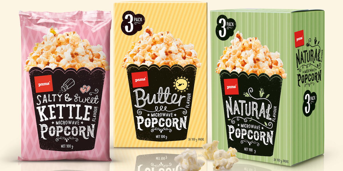
Whether you’re headed to a drive-in movie theater or just enjoying a movie at home, don’t forget the popcorn! Pams Popcorn, designed by New Zealand agency Brother Design, is ideal for popcorn lovers since they offer four amazing varieties: natural, butter, light butter, and salty and sweet kettle corn.
“Pams Popcorn is filled to the brim with old-fashioned charm and the ‘popcorn promise’ of good times and sharing. A natural palette of simply patterned papers forms the backdrop for the iconic tub silhouette, containing handcrafted type. This nostalgic yet contemporary range is easily recognisable on shelf and captures a feeling of simpler times, naturalness and authenticity. This was the key to confidently setting Pams apart from competition dominated by meteor-like popcorn imagery, saturated artificial colours and dated cliché movie graphics.”
Popcorn is a snack that people have enjoyed for ages, so pulling in a little bit of retro inspiration reminds consumers how reliably delicious it can be. Each variety has its own color and coordinating background pattern, while the font on the front looks like it was drawn on with a piece of chalk. This gives the impression of a healthier product that’s produced by a smaller company rather than a large corporation, allowing customers to trust Pams more.