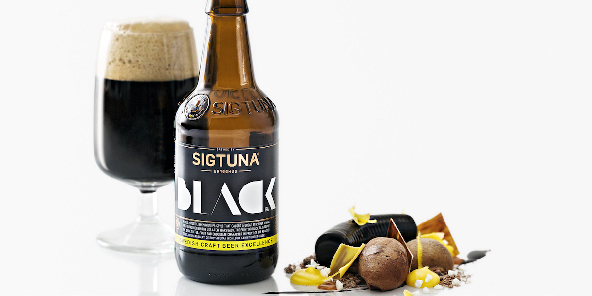
In 2005, a group of beer enthusiasts got together and started a microbrewery right outside of Stockholm, Sweden. Sigtuna Brygghus is certified to operate organic beer production, and the brewery is also powered by renewable electricity from wind- and hydropower. What started out as a small project became much bigger than anyone could have guessed at first, and they recently commissioned Crossover Creative to create a new identity, bottle shape, and packaging design.
“To create a distinctive expression in the field of ‘Craft Beer,’ it was decided to decorate the products and packaging with playful graphics, a special typeface, hand-drawn typeface logos, embossing and bronze foil. The products were coded using a clear colour idiom, and each label was printed with an in-depth description of the extraordinary properties of the beer. Through this approach, our aim was to communicate attitude and playfulness without sacrificing the premium aura.”
Sigtuna Brygghus’ new look expresses authority and strength in a modern design. A variety of fonts advertise some of the unique characteristics of each brew, while the label design remains consistent for all of the beers. The amber bottles are a little more short and stout than traditional bottles, an indication of craft beer for the discerning drinker.