THIS IS IT! DIELINE Awards 2026 Late Entry Deadline Ends Feb 28
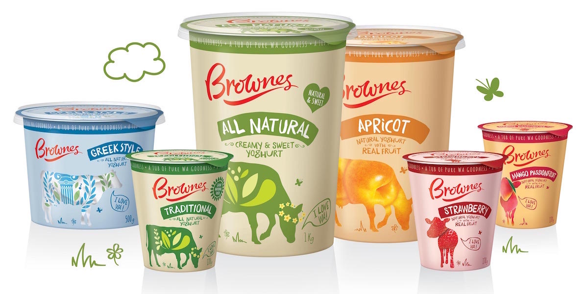
Looking to redesign existing recipes as well as make way for new flavors, Brownes Natural Yoghurt turned to Boxer & Co. for a redesign. Handling the 33 SKUs in the range, Brownes needed to emit quality and realness without coming off as too premium or expensive. Their product is an everyday essential for the modern Australian family, so the goal was to create something accessible and honest. It needed to be a clearly nourishing product without looking extremely gourmet.
“Yoghurt can be a confusing category – the small pots and multiple players can lead to a lot of noise and the impression of ‘mess’ on shelf. Boxer & Co. needed to create a design that stood out from the crowd, but not necessarily by shouting louder in the same typical FMCG photo-shop heavy language as other brands. It was time to find a new language for yoghurt.”
“On the old packs, the Brownes brand wasn’t prominent enough and didn’t translate into on shelf stand out or blocking of any sort. It was clear that a strong vehicle needed to be found, combined with clear variant indicators to help consumers navigate the range with ease.”
Get unlimited access to latest industry news, 27,000+ articles and case studies.
Have an account? Sign in