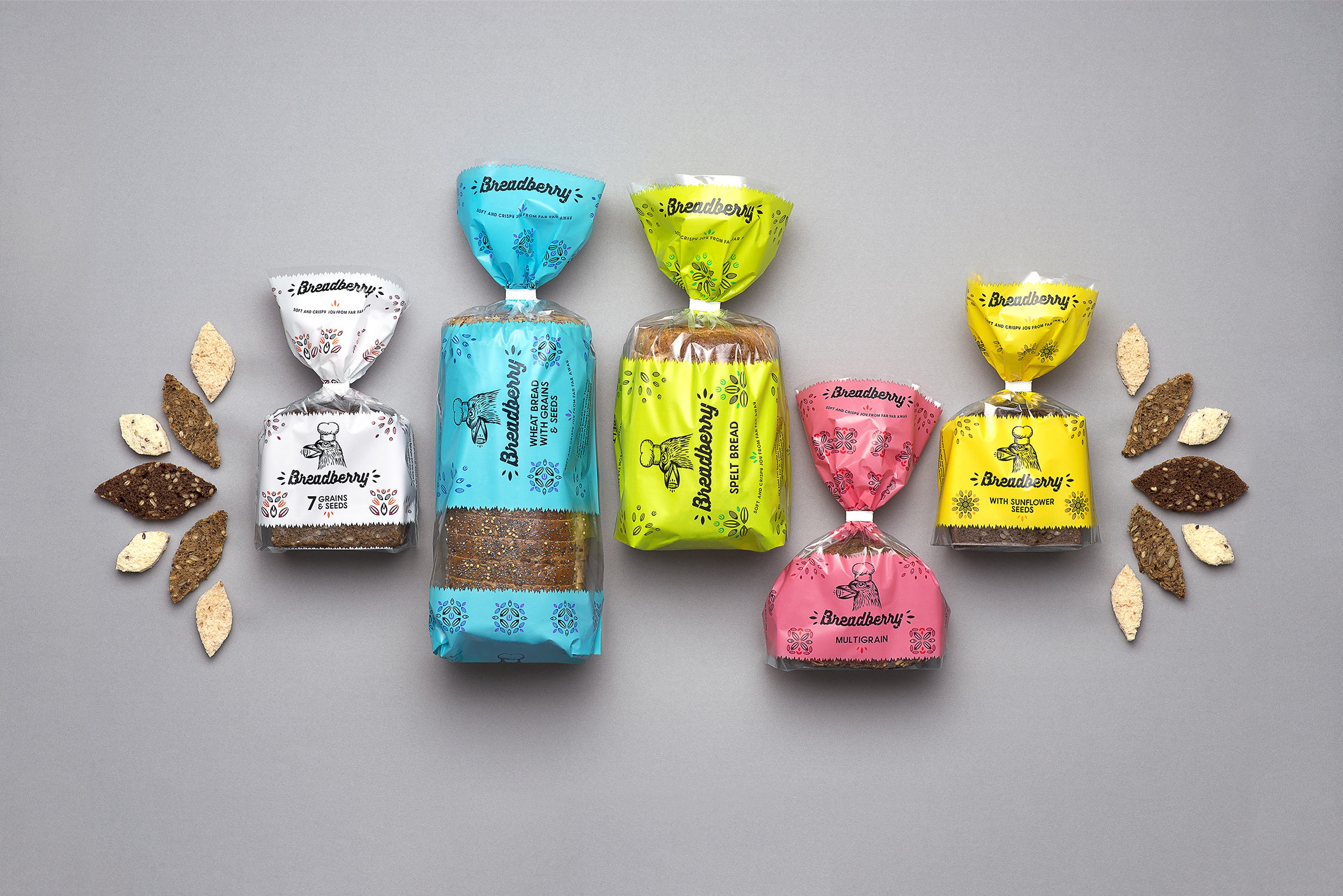
LIBRE designed the packaging for Breadberry, a bread from Lithuania that takes inspiration from baking traditions. The bread itself comes in colorful packages with illustrations of grains and seeds decorating the outside. Transparency within the packaging also provides a view of the actual loaf itself which is a nice touch for consumers looking to get their grain on.
“Vilniaus Duona, the largest bread producer in the Baltics, decided to export to the USA and the United Kingdom. Breadberry, the new export brand name was in need for a brand identity and packaging for a very special bakery product, the seeded rye bread. Hence an explanation of its brand name idea: seeds and grains are as tasty as berries.”
“Lithuania isn’t famous abroad as a bread producer so the fictitious brand legend was created: there is a country far far away where old bakery traditions are kept alive. A birdie with a baker’s cap became the main brand character who is an expert in picking the very best grain. Again, every single slice of bread is enriched with grains and seeds or ‘berries of bread’.”