Bottoms up! Get a little tipsy with a bottle of Beau Nash, a craft beer with some seriously clever packaging. JDO Brand & Design developed this Kentish ale that looks absolutely stunning no matter what way you hold it.
“JDO Brand & Design has launched ‘Beau Nash,’ a craft beer, the first of a number of brand ventures that the agency is involved in. The Kentish ale has been specially brewed using locally sourced elderflower and honey to create a light, fresh and quirky beer celebrating the local area. The award-winning design agency based in the UK, partnered with a local micro-brewery, ‘Moodley’s’ owned by Yudhistra Moodley, a self-taught brewer.”

“JDO’s aim was to develop its own bespoke ale brand with a beautifully crafted bottle showcasing the team’s knowledge of the beer sector through a love of unique and inspirational design. The agency was also keen to bring traditional design skills back to life and to give some of the younger designers a chance to develop their expertise in this area. The team enjoyed an exciting journey from the construction of the beer’s taste profile through to the development of the liquid and the craftsmanship, qualities and finish of the pack design.”
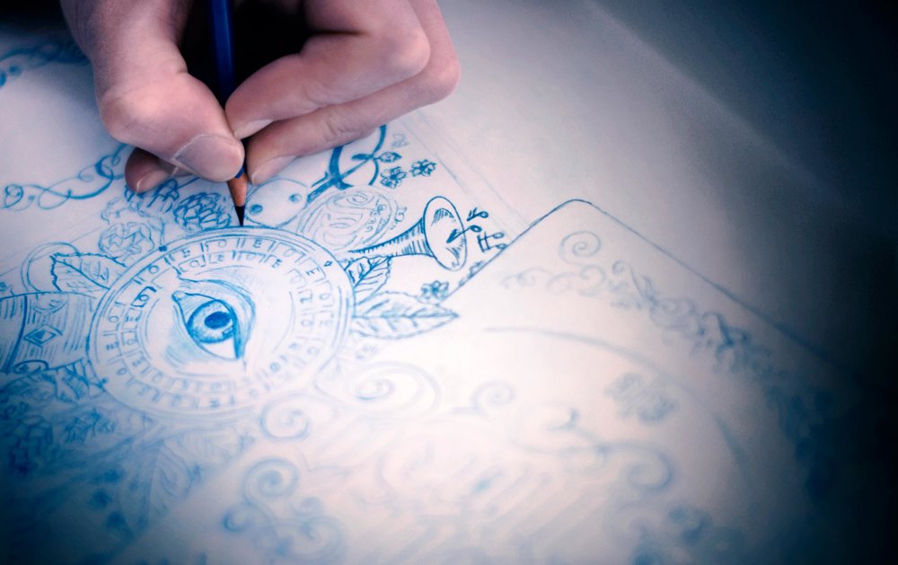
“Beau Nash” can be read on the label, both right-side up and upside down. The design is intricate and detailed which is perfectly fitting for a craft beer, and the blue details are rich and vibrant. A wax seal over the top of the bottle contributes to a more traditional feel, speaking to the age-old brewing process. Silver foil details add depth and brighten up the label, as well as giving it a luxurious feel.

“The muse and inspiration for this venture came in the form of eighteenth century character, Beau Nash, a celebrated dandy and fashion icon who appointed himself Master of Ceremonies in Tunbridge Wells in the UK in 1735. After delving deeper into his history, JDO discovered that he was not only a ‘trend setter’ but also an infamous gambler all, of which provided fertile ground for creative exploration.”
“The resulting brand design has, at its heart, three playing cards, encouraging the design to be viewed in two orientations. From this idea JDO created an ambigram for the Beau Nash identity which reads the same viewed right way up and upside down. The Beau Nash ‘lock up’ has been crafted in black type with surrounding intricate filigree drawn in the same style. The near continuous illustration on side of pack acts as a visual metaphor for the rich tapestry of Nash’s life with a little bit of JDO’s own unique characteristics mixed in.”

Designed by: JDO
Designer: Dan Bowstead
Creative Directors: Ray Smith & Ben Oates
Account Manager: Gabby Lawlor
Production Director: James Davies
Realisation Artist: Dan Healy
Country: United Kingdom


