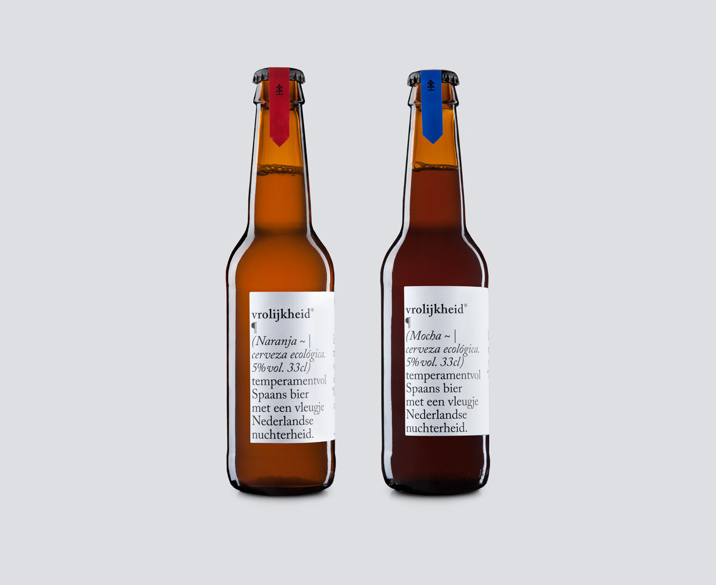
vro-lijk-heid (Dutch – noun) happiness, cheerfulness, cheer, gaiety, glee, hilarity, jocundity, jollity, joviality, liveliness, mirth, sunshine, tittup, merrymaking. 

Vrolijkheid® aims to be a new beer definition. So, when asked to work on the branding and packaging of this beer, the team at Typical Organization immediately started looking at the dictionary as a first approach for the design.

“We approached the label design as designing a language manual. Since this edition of the beer is made in Holland, we wanted to reference the Dutch Golden Age and the freedom in the press and typefaces that inspired William Caslon to design his serif typefaces.”

“Using Adobe Caslon based on Caslon’s own specimen pages we hope to communicate the fine detail and sharp contrast that would transport the beer lovers to this acclaimed climate of intellectual tolerance that seemed to breath the Dutch Republic of the 17th century.”


Designed by: Typical Organization

Client: Nelemen

Country: Greece


This placeholder is removed when the ad slot is configured.

This placeholder is removed when the ad slot is configured.

This placeholder is removed when the ad slot is configured.

This placeholder is removed when the ad slot is configured.

This placeholder is removed when the ad slot is configured.

This placeholder is removed when the ad slot is configured.