Before & After: Homespun Quinoa Crunch

Published

Filed under


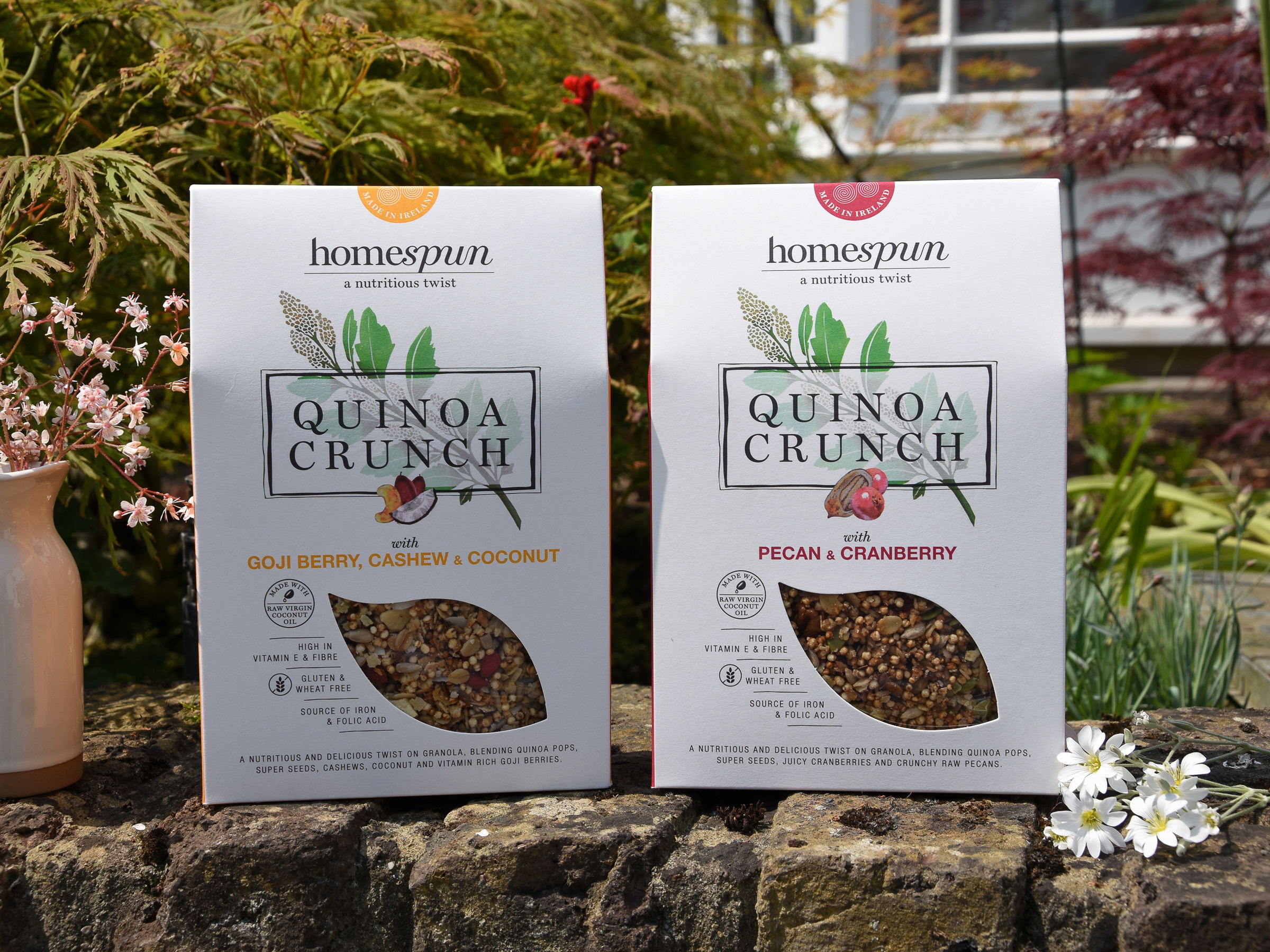
True Story, Ireland took Homespun Quinoa Crunch a ‘Farmer’s Market’ brand formally known as Pure Bia and elevated the brand to fit a national store launch. 

Pure Bia was a quinoa based cereal made in our client’s kitchen and sold at the Honest to Goodness farmers market. While the brand performed well amongst ‘market going consumers’ it was not fit for a national store launch. The name Pure Bia needed to be looked at, the brand had to be positioned correctly and a pack look and feel needed to be developed to support the brands premium position and high price point.” 

“The idea behind the brand was to take a well know recipe (granola) and give it a nutritional twist and since the brand started out in our client’s kitchen, we named it ‘Homespun’ and developed the strap line ‘a nutritious twist’. As quinoa was the main ingredient that gave the granola its nutritious twist, the quinoa plant took centre stage on pack and we commissioned Superfolk in the West of Ireland to illustrate it. 

We deliberately positioned it apart from the more traditional granolas on the market yet succeeded in making the brand appear mainstream and premium (worth paying more for) rather than niche, as many health brands do. We wrote the story of the brand, its origins and commitment to quality ingredients on pack while keeping the front of pack simple and pared back letting the design speak for itself.”

BEFORE

AFTER

Homespun (Pure Bia) reflects true growth and evolution of a homemade product sold at farmers market and now is positioned as a premium product in national chains. The previous packaging was what it was, homemade in someone’s kitchen. It lacked any hierarchy of information that can compete with the crowdedness of a supermarket shelf. Consumers have to read through a full paragraph of text to figure out what else is in the mix other than the main ingredient, quinua. True Story’s creation on the other hand brings the secondary ingredients to the forefront in both text and illustration form, making it easier for consumer to be able to make a decision at a glance.  They’ve also created a window to see the beautiful texture and colors of the product. 


Designed by True Story 

Client: Homespun Foods 

Country: Dublin, Ireland 

Illustration: Superfolk

This placeholder is removed when the ad slot is configured.

This placeholder is removed when the ad slot is configured.

This placeholder is removed when the ad slot is configured.

This placeholder is removed when the ad slot is configured.

This placeholder is removed when the ad slot is configured.

This placeholder is removed when the ad slot is configured.