THIS IS IT! DIELINE Awards 2026 Late Entry Deadline Ends Feb 28
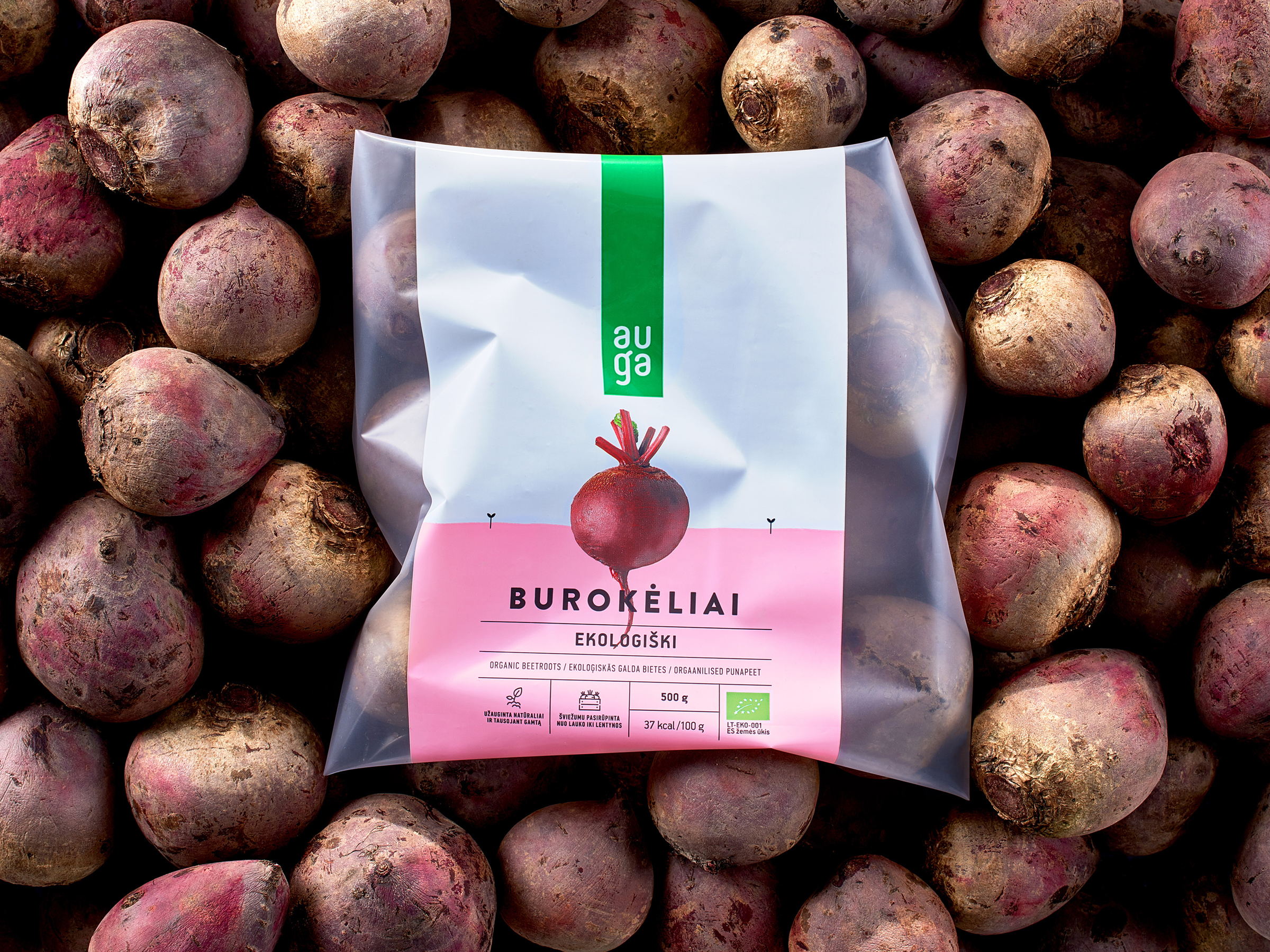
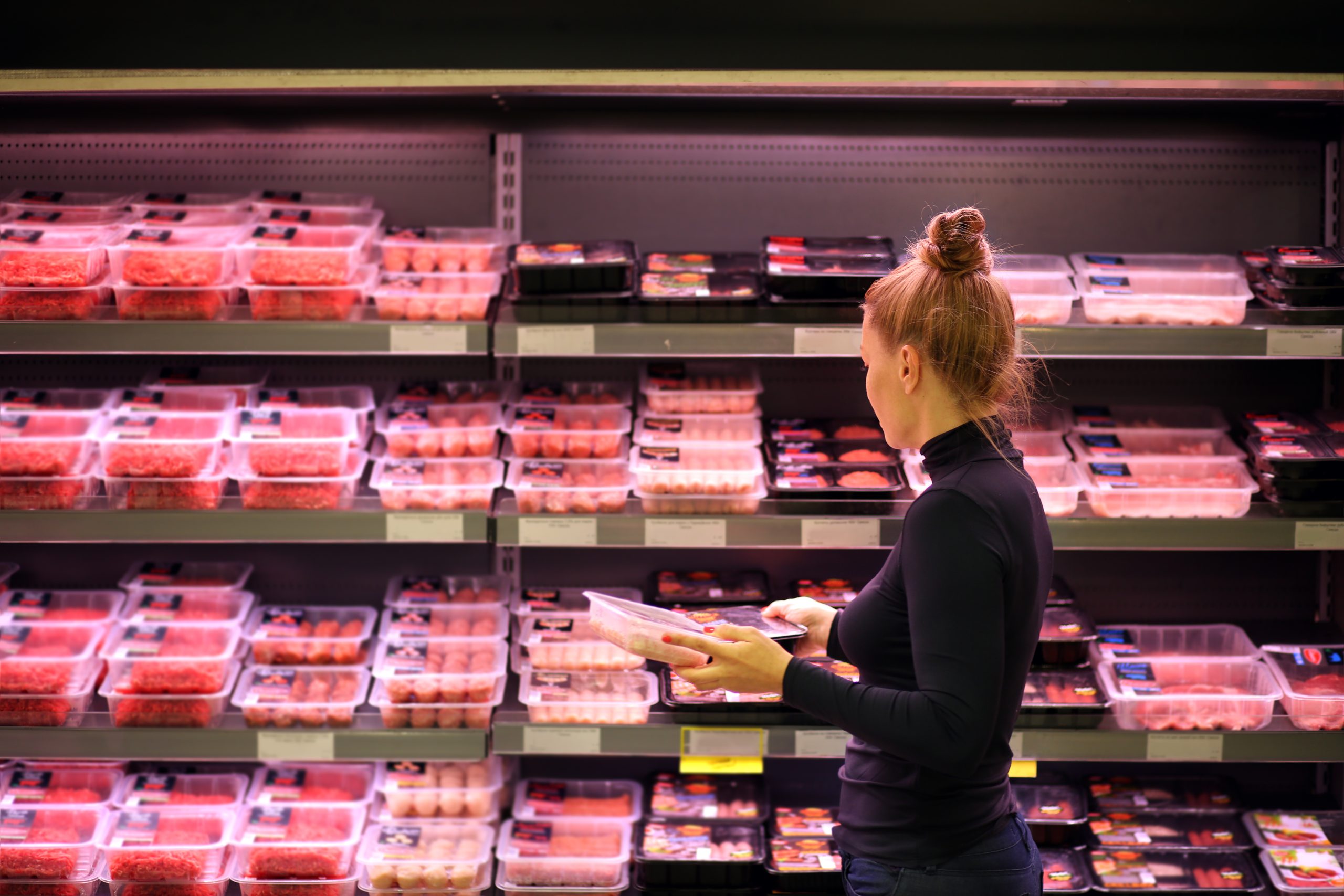
McCann Vilnius, Lithuania was tasked with creating a package design for AUGA a ‘growing’ organic food brand. The idea was to create a design that is as simple and minimal as the whole organic food concept; involving as little as possible in food growing process.
“Packaging is divided in to two parts: sky and ground. “Ground” color represents product nature, it’s natural appearance, nutritional value. And ‘sky’ is used to represent brand and product name. At the center of the packaging, we always shows main hero the product. So we see perfect balance surrounding a product.
AUGA is an ever expanding brand which is currently preparing to launch few more organic food lines. Even though AUGA is ever expanding brand, we managed to create brand recognition with simple packaging design system.”
Get unlimited access to latest industry news, 27,000+ articles and case studies.
Have an account? Sign in