THIS IS IT! DIELINE Awards 2026 Late Entry Deadline Ends Feb 28
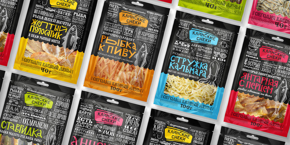
One of the most popular snack brands in Russia, Klinskie Snacks, felt it was time for a rebrand. Instead of the slightly generic and outdated packaging, SUPERMARKET Agency has created a modern and fresh design that completely rejuvenates the brand.
“Klinskie Snacks, a popular brand of snack products, is one of the leaders of the Russian market with a share of over 50% in many regions of Russia. For the line of salty snacks of fish was necessary to develop the packaging, the product is isolated from the competition, relevant to modern trends in eye-catching design.”
“SUPERMARKET team has developed a creative package in a unified concept for the entire line. Contrasting color combinations and illustrative style of the product isolated from the competition on the shelf. Text content is the consumer interest, which increases the probability of choosing this brand. The entire product line is integrated common slogan, which increases memorability. The new packaging allows to check out from the competition, increase sales and brand memorability.”
Get unlimited access to latest industry news, 27,000+ articles and case studies.
Have an account? Sign in