

This clean design is absolutely perfect for tissue and paper towels. White Leaf Hygiene Papers are packaged beautifully as well as conveniently for consumers, making the buying experience easier. Designed by Caparo, White Leaf’s approach uses a refreshing, bright packaging that emphasizes order and organization. Focused less on the shelf appeal and more with companies and small businesses looking to buy for the office, the product needs to have a strong image that builds trust among buyers.

“The client said: We do not sell on the shelf. We target new clients and the clients we already have mostly in Greece but with an open horizon to other markets. These are professionals, large and small businesses like banks, hotels, companies, hospitals & clinics, organizations etc. Our common client (usually the supply / office manager of a company) evaluates and selects the product by researching the technical characteristics, price and obviously the brand image among others. There is a possibility and we want to maintain the potential to expand the product distribution to the consumer market too.”

“The brand: We designed a new brand from scratch. Named ‘White leaf’ with a rich semiological references. The obvious reading is the verbal description of the product. The secondary message is double. Firstly in Greek the word ‘leaf’ is also used instead of ‘sheet.’ For instance it is expressed: ‘a sheet of paper (when you refer to paper)’ — think leaf instead of paper. So the connotation drives you to read it as: “a white sheet (leaf) of paper” (Greek: ένα φύλλο χαρτί). Regardless this interpretation the word leaf still keeps it’s basic reference to nature that is the raw material which the product is made of.”


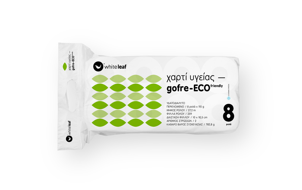


“The packaging idea: Hygiene papers conceived and designed as professional equipment. Differentiated from the clichés and visual decorations of mass market (butterflies, puppies, cute animals, etc.) the packs highlight the technical characteristics and info of the products that the consumer is interested in without having the ‘insecurity’ of the shelf. Marked distinctly depending on the type of paper (gofre – smooth) the white background and clear structured typography create an aesthetically consistent result with a comprehensive feeling of softness and confidence that cleanliness and quality of the raw material provide.”


Designed by Caparo
Client: Eurosyst S.A.
Country: Greece
City: Athens


