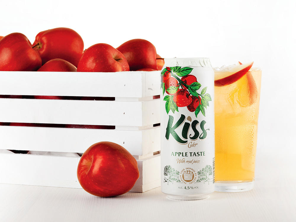
At the end of a hot day, a refreshing flavored cider would definitely hit the spot. Estonian agency The Division created a mouthwatering identity and packaging for Kiss Cider, a line of flavored cider beverages. Bright, colorful fruits drape down the tops of the cans, and actual images of dewy, fresh fruits appear in the promotional materials.
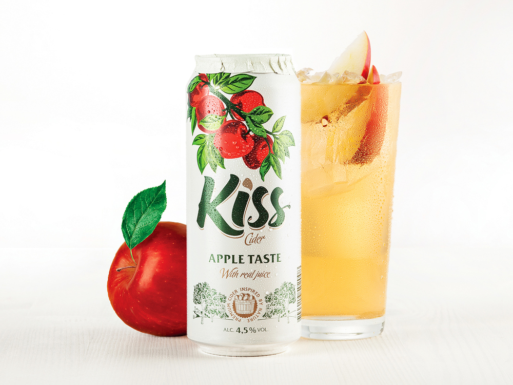
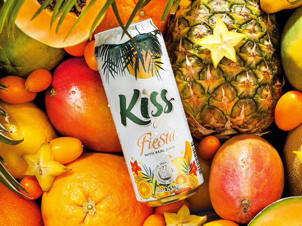

The main colors of the can are white, gold, and green which ties in nicely with the green leaves of the fruit trees. Illustrations look like they’re straight out of a fanciful storybook, and the Kiss brand name is written in a thick font that looks almost handwritten. Along with the gold accents, it truly emphasizes that Kiss is a premium cider inspired by nature.