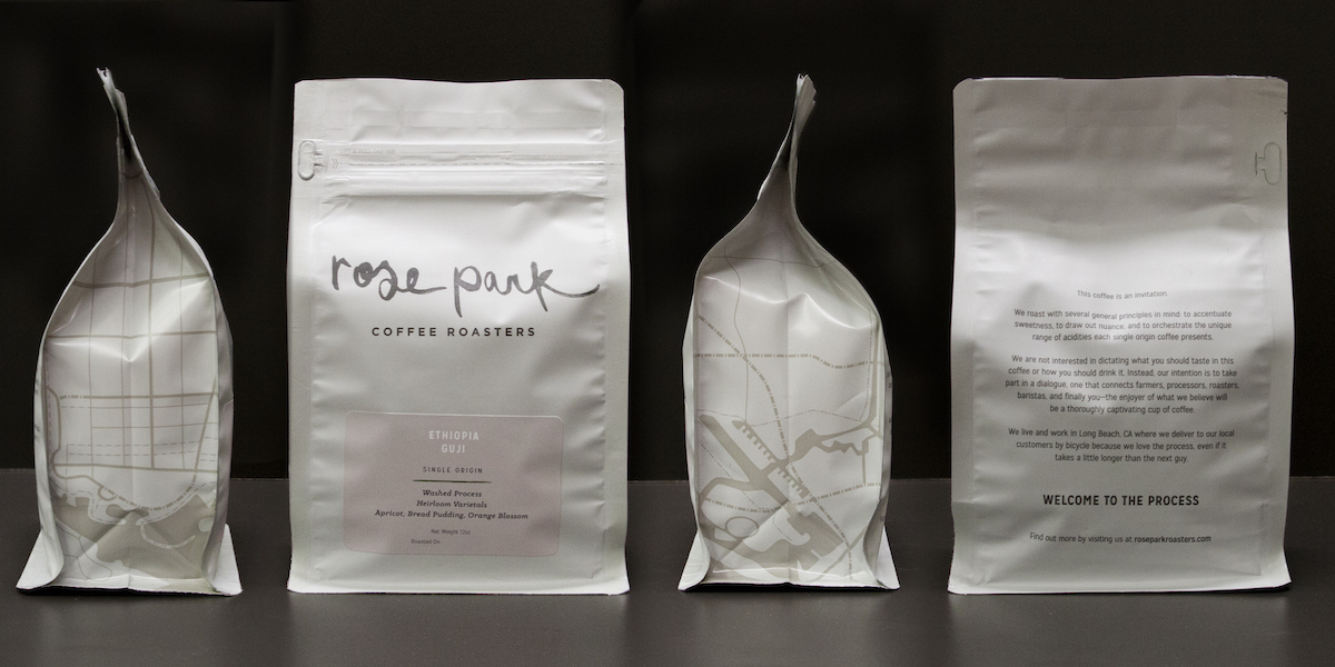
“This coffee is an invitation.” An invitation to what, exactly? One to join the process and discussion that connects farmers, processors, roasters, baristas, and you. I’m not a coffee drinker myself, but the work that Camp Design Group did for Rose Park Roasters is undeniably beautiful.
“Soothing muted tones coupled with a silky exterior finish makes this packaging stand out as an understated luxury. Both packaging and logo were designed by CAMP Design Group. The hand brushed watercolor logo of Rose Park Roasters helps to connect the necessity and ritual of coffee as a universal experience. On either side of the packaging the brand is grounded as a neighborhood staple with a map of Long Beach, CA. Specific flavor profiles are enhanced by a clean milky typeface and set against rich robust colored slabs printed in the lower center to provide optimal viewing of product knowledge. The bottom panel is kraft paper as a reminder of Rose Park Roasters humble foundation.”
It’s always a bit of a pleasant surprise to see coffee brands veer from the usual dark, moody browns and deep, rich hues to bring you something bright and lovely. The packaging’s fresh look serves in two ways — by clearly communicating the small business that is Rose Park Roasters and also by elevating the brand. The hand brushed watercolor logo is unique, and the map of Long Beach helps to connect the roasters to the area and incorporate them into the community.


