Featured image for Collection: Food Subscription Boxes

Collection: Food Subscription Boxes

by Elizabeth Freeman on 08/07/2015 | 9 Minute Read

Editorial photograph

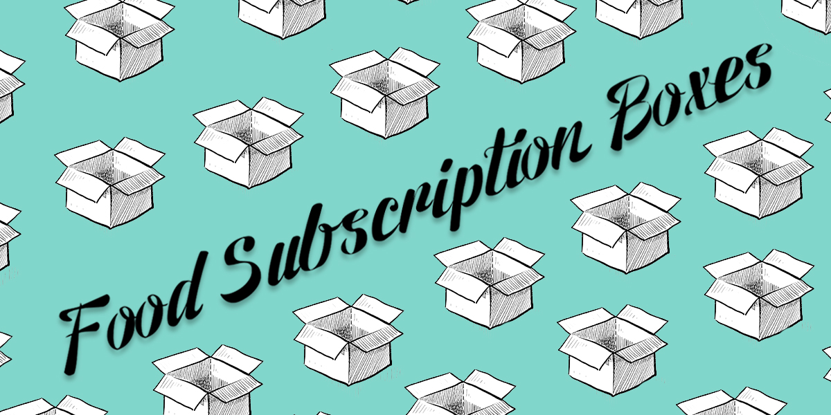
Monthly subscription boxes are incredibly popular at the moment! I would venture to say that there is a subscription package out there that caters to anything your heart desires. Beauty products, cell phone gadgets, #cuteshit collectibles and lots of FOOD. For this article, I’m exploring the gourmet and specialty food markets to take a look at how they are packing their products up and sending them out to subscribers. While many of the boxes have a similar structure, with a lift up lid, the different ways each company brands themselves really differentiates the winners from the losers. After hours of researching for this blog post, I am pleased with my self-control of only purchasing a single subscription box. No food for me, I chose the Kawaii Box. 


Mantry

Editorial photograph

Mantry just might be the most unique packaging design I came across in the subscription box world. The company is self-described as “the modern man’s pantry” and features a monthly theme of artisan food products. Delivered each month in their signature wooden crate, Mantry stands out from the crowd with gusto.

The rugged wooden crate reflects the “manliness” of the modern male palette. It is branded with the company’s name and tagline, and typeset in a classic, vintage style. Each month features a theme of ingredients and comes with a fold out card to detail the producers behind the foods included. With no details overlooked, the fold out card is simple and laid out beautifully. Mantry’s subscription service is a stand out with its well-developed brand and clever packaging design. 

Graze

Editorial photograph

Graze is a UK based mini-snack subscription box that is all about healthy snacking. With the tagline “Snacking Reinvented” you get the idea that Graze is going to show you a new way of eating. The fun selling point of the Graze subscription is that each customer gets to customize their box, choosing from over 100 natural and healthy treats. 

Arriving in a simple cardboard box with the company’s name and tagline, the top flap opens up to show a beautiful, oversize color image of something healthy and fresh. The bottom portion of the box features 4 cubbies that hold the variety of snacks you’ve specially picked out. The snacks come packaged, but they can be opened and poured into the individual cubbies which then turns the box into a display tray. It’s a thoughtful solution to eliminate the need for snack bowls, and pretty enough that you forget you’re eating out of a cardboard box.

Orange Glad

Editorial photograph

Orange Glad Sweet Box has me pulling my credit card out and drooling as I write this. A gourmet desserts subscription service, the monthly box includes 5 goodies from artisanal bakeries across the nation. Sweets and treats are enjoyable, right? So you can, expect Orange Glad’s branding to be playful and light, and infused with the color orange. 

The art direction leans toward the female market, as desserts are often known as one of a woman’s guilty pleasure. The packaging design is compromised of a two color palette - the brand orange printed on top of a white cardboard box. The brand name is typeset in a slightly decorative san serif font, which looks like a close contender to the popular Museo. Wrapping around the box in a thick, orange stripe is a cute illustrated pattern of cupcakes, candies and ice creams. The Orange Glad Sweet Box seems like a great gift choice, arriving in a cheerful box and full of sweet surprises. 

Lick My Dip

Editorial photograph

There’s no questioning what the Lick My Dip subscription box contains. With a brand identity that piggy-backs off the iconic tabasco logo, it screams SPICY. Lick My Dip sends out the very best British Hot Sauce, fiery snacks and chili powders each month for those who are looking for some punch to add to the meals. I was surprised this was a British company, after living in London for 6 months I had no idea the Brits were hot sauce fans.

The white subscription box has a large logo featuring a chili pepper. The geometric shape of the logo is reminiscent of the tabasco logo and the color palette features the exact same red and green hues. Design-wise, this is where the similarity ends. However, there's no doubt about the contents of this package. The words “Subscription Hot Sauce” are emblazoned on the side. Just a little warning to the postman, spicy contents inside - be careful!

Mistobox

Editorial photograph

Based on Americans love for coffee, and the recent craft coffee craze I’d guess that coffee subscription boxes are best sellers. Mistobox is perfect for coffee aficionados that would like to sample 4 different beans each month, and ”never run out of coffee again.” You can see the retro design trend in the MIstobox brand, simple typography, a circular emblem of the brand initials and a classic cardboard box. 

Simple on the outside, once you open the box you will be treated to a cute pattern of coffee mugs against the Mistobox brand red  background. It’s refreshing to see a coffee product setting aside the usual all brown color palette and throwing in some heat with that bright red branding. 

Carnivore Club

Editorial photograph

Arriving in a faux wooden box with a huge “Carnivore Club” logo on the front, you know what you’re in for when you rip this baby open. The Carnivore Club is a subscription box that sends out a variety of artisan meats each month for “discerning individuals.” While women enjoy meat also, this packaging design is obviously geared towards the male demographic. 

The words “artisan,” “handcrafted” and “exclusive” are trending within the food world, and the Carnivore Club has hopped on this train. Their crest and banner logo feature bold typography and a big grill fork replacing the letter “i.” It’s pretty cute. Inside the box the meats are tucked into shredded brown paper for packaging purposes, which adds a little extra detail to the press

Sporkpack

Editorial photograph

The SporkPack subscription box is based on the interesting concept of combining both yummy treats and entertaining kitchen gadgets into a monthly subscription. Each package comes with handpicked  kitchen tools and delectable treats tucked inside a bright yellow branded box. I’m curious how the company came up with the name “Spork.” For any of you NOT in the know, a spork is a cross between a spoon and a fork, and its become quite popular over the last few years. 

Following the theme of the company’s name, spork icons are used throughout all the product packaging. It’s a really playful idea and makes both a great pattern and can also be used in an oversized scale. Unwrapping a SporkBox looks like it would be a lot of fun, stuffed with yellow tissue paper and a variety of goodies. I think this subscription box would be similar to receiving a birthday gift once a month - you have no idea what’s inside, but most likely it's going to be frivolous. 

Editorial photograph

Oh Watanut! Another healthy snack subscription box, this one for nut lovers. I am a huge nut lover, always snacking on my almonds and pistachios from Trader Joe’s. And, I really like the idea of getting “nuts of the month” delivered to my Los Angeles doorstep. 

Watanut has some lively packaging for this somewhat boring snack. It screams “Go nuts!” (as if I need anyone to encourage me). A cardboard box printed with a 2 color palette of white and olive inks. There are silly line art illustrations covering every inch of the box in the white ink with a big, fat, olive colored Watanut logo screaming across the front. The logomark resembles the shape of a simplified peanut and has some wacky font mixing going on within it. With this subscription box I say, “Go nuts and give nuts” – or maybe that’s their actual tagline.

The Bon Appétit Box

Editorial photograph

Bon Appétit Box is a gourmet french food box subscription that has some pretty charming packaging. This subscription is geared towards the “refined palettes” who are ready to be whisked away on a French culinary adventure of foods I probably can’t pronounce. The packaging for this monthly subscription captures the essence of Parisian dining combined with a modern aesthetic. 

The Bon Appétit Box, with its red and white palette, is my favorite of the blog round up (which means it’s probably a bit girly). The logo is a scalloped shape enclosure with the company and an illustration of the Eiffel Tower making up the “A” shape in the word “Appétit.”

The base of the packaging is the brand red with a high contrast white lid featuring the logo mark set in the center. Each box is sturdy and lined inside with a petite red and white check pattern. The type of box I would want to hold on to for future uses. I'm sure they would stack up pretty fast with a monthly subscription, but I’m sure I could find a purpose for them.  


Editorial photograph

Written by Jenifer Tracy

Jenifer Tracy is the owner and Creative Director of JENCO CREATIVE, a boutique graphic design studio founded in 2007 in sunny Los Angeles. Jenifer’s work has been recognized as smart, effective and inspired and has won multiple awards. Having worked with a diverse range of clients from the  Got MILK campaign to Mary J. Blige, Jenifer has a relentless desire to create quality work that expresses her client’s personality and vision.

On a personal note, Jenifer splits her time between Los Angeles and London, is a French Bulldog enthusiast and a “cute shit” collector. As a designer with a deep love for pretty packaging, Jenifer is thrilled to be blogging for The Dieline, a site she’s been a fan of for years. Jenifer spends her spare time dog walking her frenchie Pippin, getting her nails done and napping. She’s also known for being a big loud talker and laughing a lot.