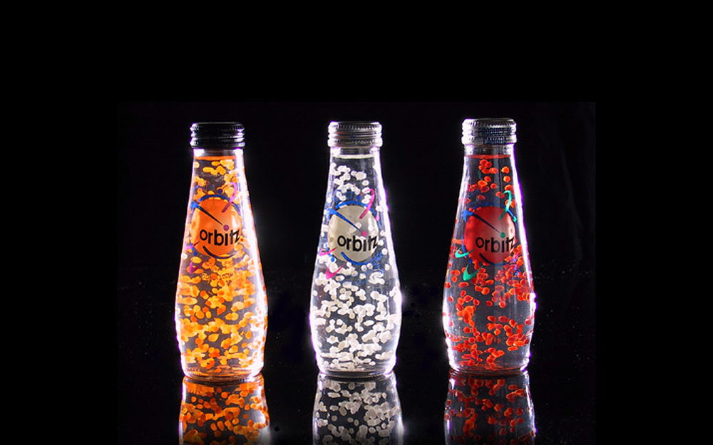
Oh the 90’s, an equal parts chaotic and exciting period for graphic design. The advancement of computers and applications like Quark Express (RIP) and Illustrator opened the world to experimental, complex and often frenetic arrangements of type and visuals. (David Carson, I’m looking at you) As for packaging, the more you could stand out on shelf, the better. Strokes, drop shadows, gradients and futuristic/organic shapes ruled the package world. Layer a neon green starburst over an orange drop shadow? That will definitely pop! Seven different typefaces on one bottle? Has to be better than one! But amongst the chaos there were a handful of brands that were able to breakthrough with some pretty memorable packages. Some for their ingenuity, others for their restraint and some simply for being plain old awesome. So break out your Magic Eye books, your Pogs, your Mancala and your Tamagotchi, these are my top 10 package designs of the 90’s. (Disclaimer, I work for The Coca-Cola Company)
