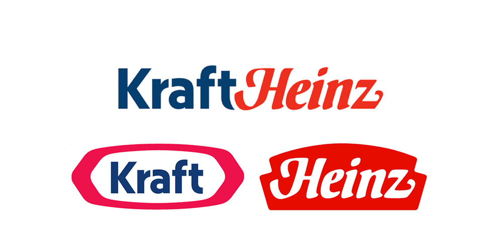
Last month’s merger of the two companies Kraft and Heinz not only increased investments in marketing and innovation but sparked a new logo design. The two logos were slightly altered with the wordmarks taken out but still remain true to what each company was and still is known for. By uniting the two iconic logos, the curve of the “t” in Kraft flows beautifully into the curve of the “H” in Heinz almost like they were meant to be together.
Via Creativity


