Extravirgen is a Mexican brand of natural and organic products, free of gluten, dairy and preservatives. The name makes reference to the positive properties of the products.
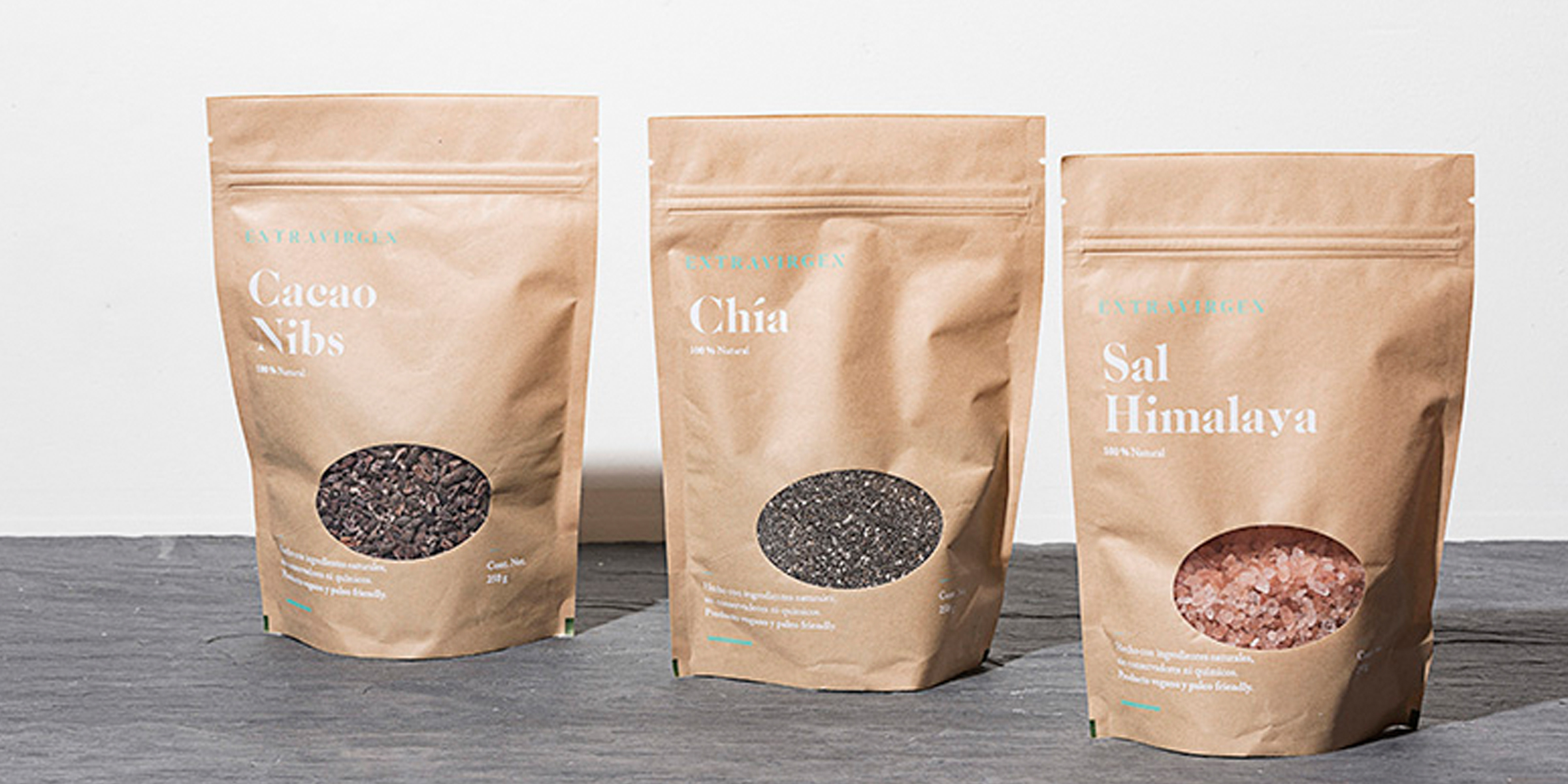
Our branding solution is based on the value of honesty. We develop a very clear graphic language that gets away from ornaments and distractors. The typography is the main element and a clue to the communication; through hierarchy we gave more importance to the product than to the brand. At the same time, we used a see-through resource in all the packaging. The reason why we get to this solution is because the products are genuinely good and the benefices that offer are so high that they don’t need reinterpretations in order to sell.
The logo’s typography plays with the absence of certain details in the characters, this makes reference to the fact that the products don’t have unnecessary elements that could be harmful to health, keeping and showing only the best part.