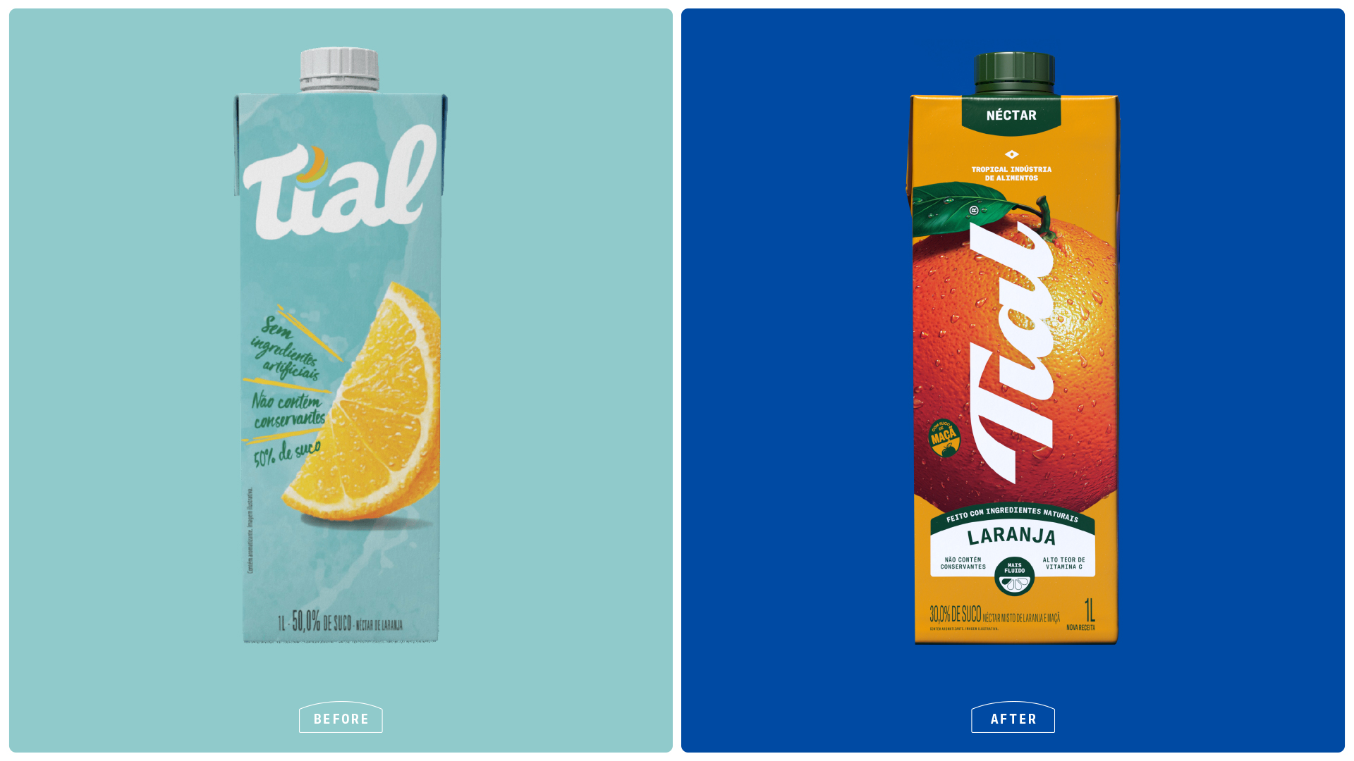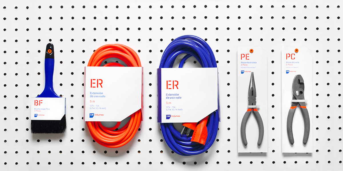
What better way to stand out from your competitors than to go bold. With a brilliant saturation of blue and orange, the colors highlight the product against a clean white canvas. Designed by Firmalt Agency, hardware supplies are modernized to fit the needs of the design community. Simple stencil type abbreviates the products’ name while an easy to read description lets the consumer know exactly what they are buying.
“Indumex is not your ordinary hardware store. With the purpose of revolutionizing the industry, this establishment is your one stop shop for construction and improvement hardware. Their wide variety of product lines, and the superior customer service they offer make the shopping experience appealing to every handyman in the area.”
“The concept was brought to life intending to portray the brand’s values – professionalism and trust. The idea was to convey expertise, without loosing approachability. The color palette intends to show contrast, emphasizing Indumex innovation in the market. Blue depicts trust while orange shows boldness. We designed custom typography for the word mark, and chose a straightforward typeface for other applications to depict the industrial facet of the brand.”