If you’ve walked down a city street recently, or taken public transportation, you have likely noticed that half the people passing you have earpods tucked into their ears. Listening to music has long been a cultural pastime and it has become easy to carry it with you wherever you go. I suppose it was just a matter of time and research before a product was created that allowed people who are deaf or hearing impaired to enjoy a musical experience too.
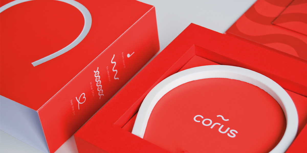
Corus is an interesting concept project by Apiwat (Peet) Anuntrachartwong which is a C-shaped vibrational collar that would sit around the hearing impaired person’s neck and deliver musical vibrations. Pretty cool, right? The collar is a simple C shape and is very sleek and minimal (Apple would approve). The entire brand identity and the packaging design for the product follows the product’s aesthetic of modern simplicity.
“The name Corus comes from the mixing of the word ‘core’ and ‘chorus’. ‘Core’ represent the vibration that is the core of the sound, and ‘chorus’ is the part of the song structure, which is the refrain or a repeat of the catchy part of the song, represent the idea of the hearing impaired could ‘hear’ (feel) the music again like the chorus that comes back in the song.”
The product name “Corus” is set in a smooth, round font with a tilde symbol above the letter “R.” The tilde symbol represents the connection between the language of music and the vibrational waves of sound. You will see the tilde icon being used as a key element throughout the product’s art direction, not just incorporated into the logo.
Flaming bright red is the color of choice for this brand, always paired with white. Red is an emotionally intense color, it is associated with energy and excitement. Between the energy of red and the wave patterning of the tilde, you can almost “feel” the representation of this vibrational music.
The C neck music player comes packaged very nicely. A front flap lifts open like a jewlery box to reveal the product and other accessories that are nested inside. The tilde wave patterning is used on the inside flap of the box, with a small pocket envelope mounted to it which includes a musical vibration CD. The C neck player is the hero inside this box and brightly pops out with its high contrast white color against the red packaging.