Student: Tai Yan Yu – Kinmen sea salt specialty packaging
By
Published
Filed under
By
Published
Filed under
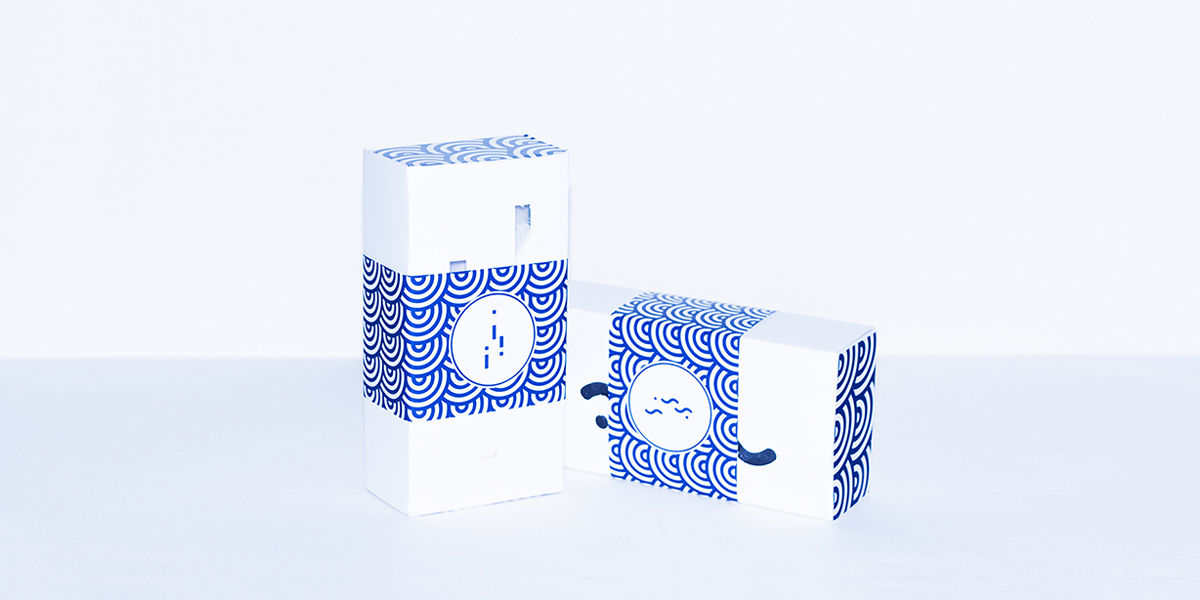
Tai Yan Yu Sea Salt is a product of Kinmen, a small archipelago of several islands, governed by Taiwan. It’s an island whose main industry is tourism and is also known for a number of cultural and specialty food products. Two of the specialties hailing from Kinmen are the local sea salt and seaweed. And, with a tourist economy in mind these products needed packaging design that was attractive and giftable for travelers to take back to the mainland with them.
The designer for this project, Chen Wu, calls Kinmen his hometown and wanted to create a design that would promote the characteristics of the island. Wu chose to work with a simple, beautiful blue and white color palette for all elements of the products packaging. These colors are symbolic of the clean island air, which is a sharp contrast to the pollution of mainland Taiwan.
Wu created a simple wave pattern to use as the dominant art direction throughout all pieces of the Tai Yan Yu Sea Salt packaging. The wave being emblematic of the ocean which surrounds Kinmen and from which the products are harvested. There is also an abstract sea salt and seaweed symbol that Wu has incorporated intermittently throughout the packages.
There are two sizes of packaging for the Tai Yan Yu Sea Salt, with the shape and design being significantly different from one another. The small product packages are mostly white, with a belly band covered in the wave pattern slipped over the center of the box. In my opinion, a belly band can really be a nice touch, it has the ability to take a simple box and transform it into a gift.
Get unlimited access to latest industry news, 27,000+ articles and case studies.
Have an account? Sign in