Forget FOMO, I think we’re all way more interested in experiencing JOMO. Instead of the “fear of missing out,” let’s have the “joy of missing out” and relish in the relaxation away from life’s everyday stresses. Alaa Abuamra created Pure Jomo with this goal, wanting to design a luxury brand to help consumers step away from the clutter in their minds.
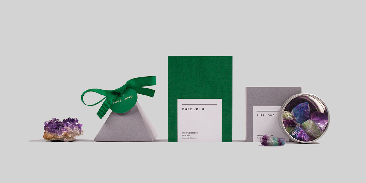
“The brand consist of five different products which are gemstone, conch shell, tea, essential oils, and kinetic sand. Each element is associated with one of the five senses. The user can learn more about these products through the booklet or the website. The package design was kept minimal to deliver a clear message about the benefit of the product and instruction on how to use the product. The colours of the brand reflect the nature that the products came from.”
Pure Jomo encourages users to truly value the little things in life. Using simple items that get in touch with nature can help them escape, if even for just a short period of time. The color palette primarily consists of white and forest green, with hints of black or grey. With its sans serif font and crisp label, it exudes a modern attitude, encouraging consumers to disconnect and take time for themselves. Each item is packaged almost like a small present, holding deep meaning and value, and the posters magnify the feeling that can be achieved by using the product.