Featured image for Press Juice

Press Juice

by Theresa Christine Johnson on 06/03/2015 | 3 Minute Read

Editorial photograph

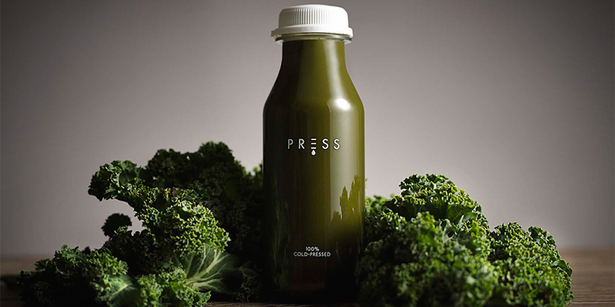
For busy, health-conscious Londoners who demand the best quality for the products they choose, Press Juice is will be something to talk about. The new premium juice company turned needed identity and packaging, and Mercer Studio created a design that would reflect that process of the juice itself.

Editorial photographEditorial photographEditorial photograph

“Cold Pressing is a technique of extracting juice from fruit and vegetables that retains nutrient content, purity of flavour and quality consistency. This is in strong contrast to traditional juicing techniques of pasteurization or blending that have a negative effect on nutritional values and flavour. The identity was created to communicate both the physical process of the cold-press technique and the premium quality of the product.”

The logo is comprised of a thin, all-caps text, with a droplet coming down from the “E.” This allows for the entirety of the logo to be used but also for the “E” by itself to stand alone and still clearly indicate the brand.

Editorial photographEditorial photograph

For such a pure product, a pure packaging approach was necessary. The clear bottle has almost no text on it, other than the logo and the words “100% Cold-Pressed.” The rich colors of the juice create an all-natural color palette of earthy, vibrant hues. The white twist-off cap has a small tab to keep it sealed and keep the quality juice fresh.

Editorial photograph

Designed by Mercer Studio

Country: United Kingdom

City: Londo