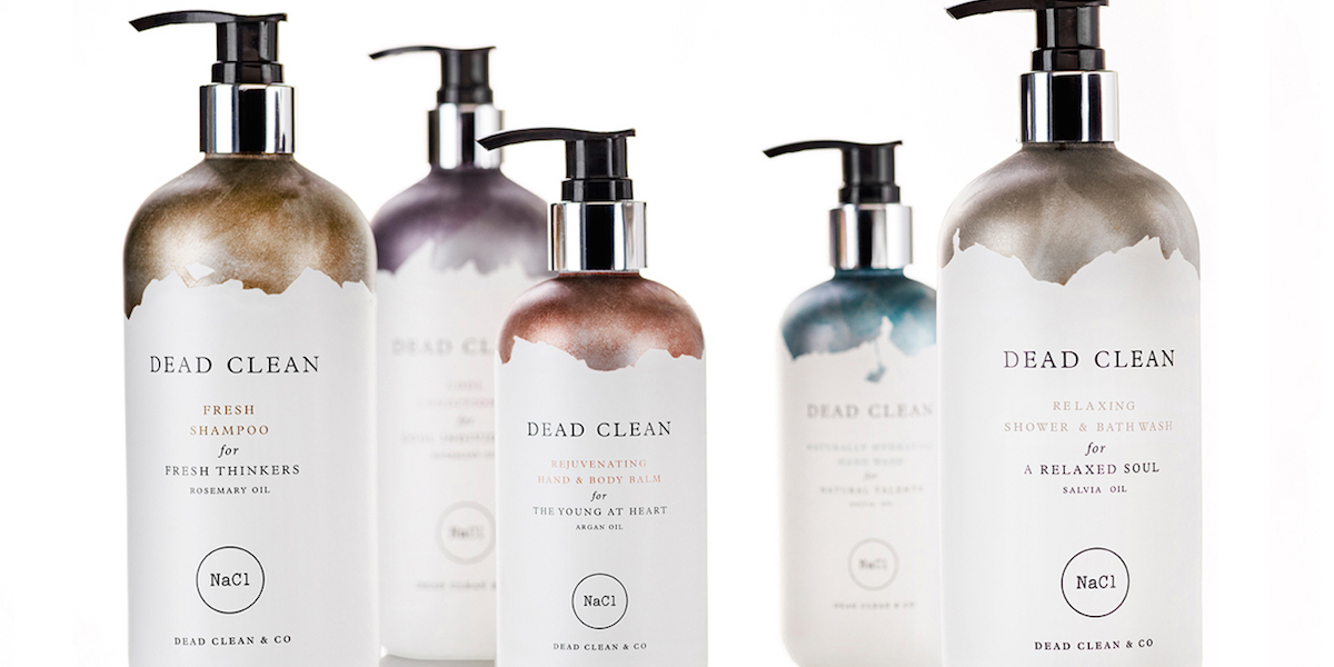
For years, people have been trying to bottle the natural powers of the Dead Sea, since the rare minerals and salts found in the water work wonders for the skin. For such an extraordinary product, the packaging must match what’s inside. Koniak Design has created a simple yet uniquely stunning package design for Dead Clean skin care products.
“Dead Clean is one of most interesting projects the studio has had the pleasure of taking part in- working alongside Europe Hotels, in developing a full-range skin care product line, a brand strategy and a corporate language. The Dead Clean Line is based on original salt from the Dead Sea, high quality essential oils derived from naturally grown herbs & a signature Mint Tea fragrance created by Mathieu Nardin.”
The bottle is mostly white, with an elegant black font, suitable for a boutique bath and body care shop. What stands out the most, though, are the metallic colors at the top of each bottle. The minerals themselves inspired this idea, creating a product that appears superior to others on the market. Also, the idea of something slightly gritty and metallic gets the consumer thinking about exfoliation and getting their skin, well, dead clean.


