
Germany is known for a lot of things, but there’s one that you’ll almost always find at the top of that list: beer. The Wernesgrüner brewery’s 1436 beer is unique in that it has a modern-retro vibe. Christoph Petersen Design GmbH was faced with a challenge, wanting to create a new design for the brew that appeared old, but not antiquated.


“It quickly became clear to us that to appear authentic we have to work authentically. In researching the history of the brewery in Vogtland, Saxony, we came across a rather special figure that we resurrected for our design — the ‘Wernesgrüner Freshness Messenger.’ A reinterpretation of the medieval seal also contributed to the development of a design with a convincing sense of history. The colours and materials used help to visualise the refreshing taste of this special beer.”


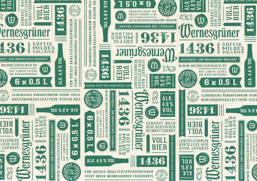
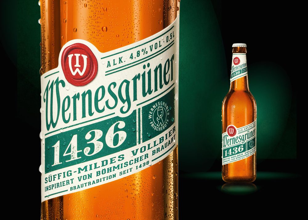
The bottle features a classic text that may seem common among other beer, however the front label is slanted (as well as the lines of text on the back label), adding a splash of modernity and fun. The amber bottle feels traditional, but also allows the greens and reds of the label and logo to pop. Small graphics on the label, such as lines, blocks of color, and arrows add to the contemporary vibe. Wernesgrüner 1436 perfectly walks a line between two different ideas, combining them in a thoughtful manner.
Creative Director: Sandra Roth, Karsten Kummer
Designer: Nelli Gerner


