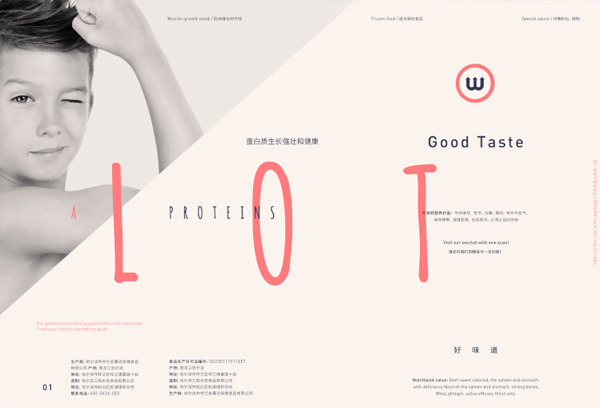
In China, steak is considered to be an incredibly special meal that is especially good for children. After doing some market research, Tom Jueris discovered that most people buying steak in the country were mothers purchasing it for their kids, so with that in mind, he redesigned the logo and packaging with a pinpointed focus. At the same time, the design still provides valuable information for the consumer in a beautifully simple way.


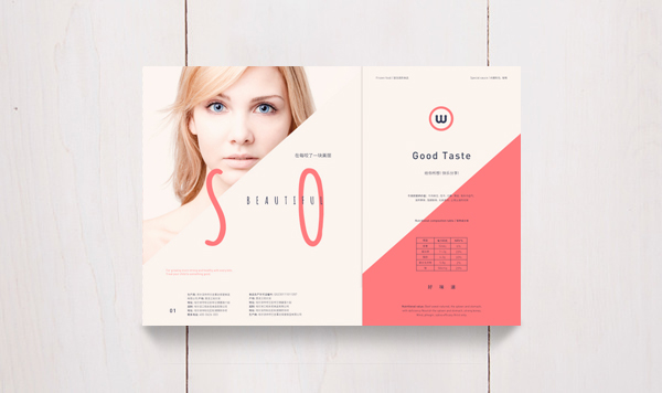
“After brainstorming with the client, we decided to design the packaging mainly concentrated for children and young people, however with a second purpose in every packaging. That motivated me to propose a different and new solution to the steak market in China.”

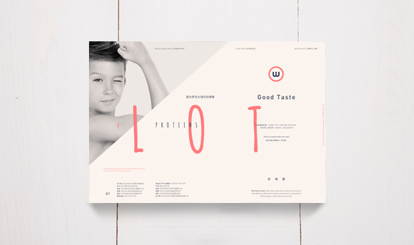

The somewhat muted, sun-faded colors have an almost 70’s feel to them and lets the images of the meat stand out. A small, transparent window allows the consumer to view the actual cut, complete with an image to show where it comes from on the animal. The inside foil packaging keeps the round steak fresh, and even has a “Q” for “Quality” cleverly hidden on it.