

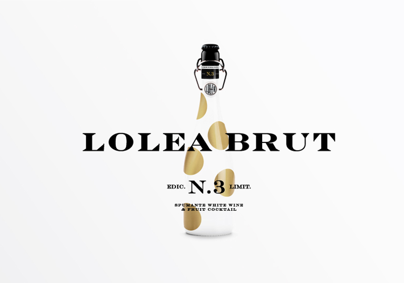
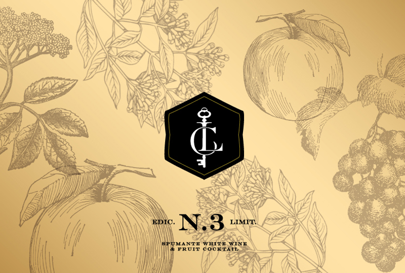
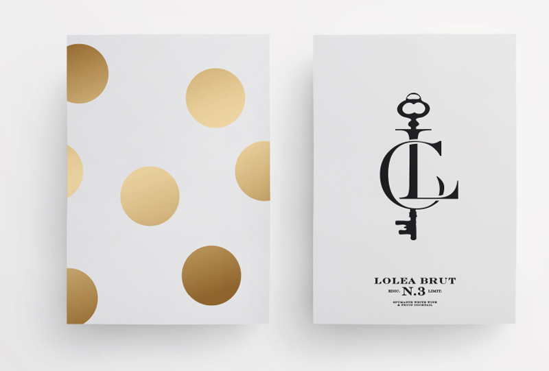
A piece of packaging that really cheers us up. The branding of Sangria Lolea Brut, designed by Estudio Versus, is characterized by a lightness and cheerfulness that really lift the spirit.
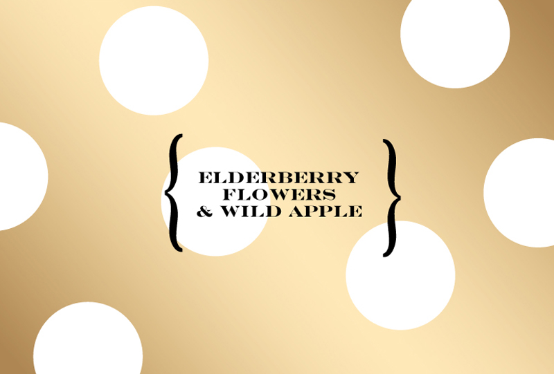
The product, an innovative cocktail recipe with sparkling wine with elderberry flowers and wild apples, prides itself for its interesting and fresh flavours and for its playful personality.
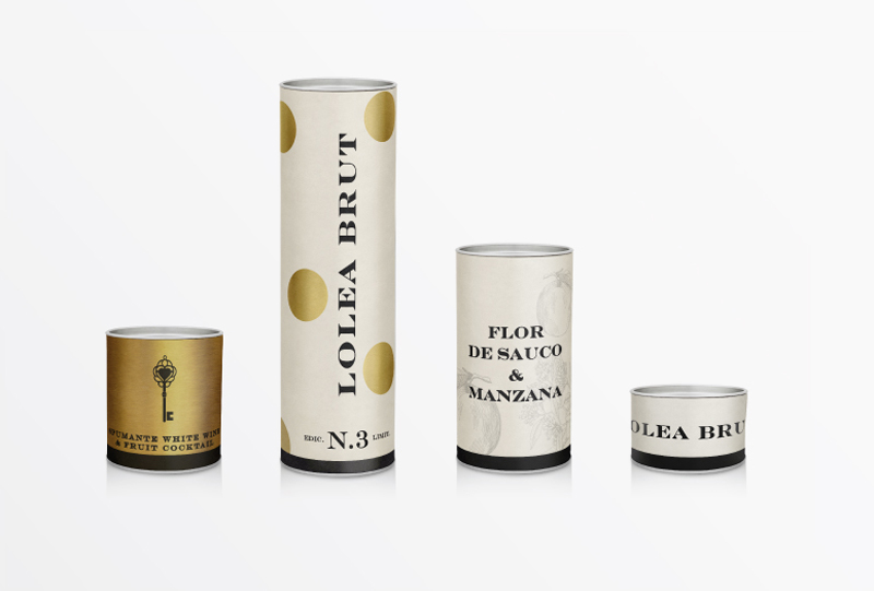
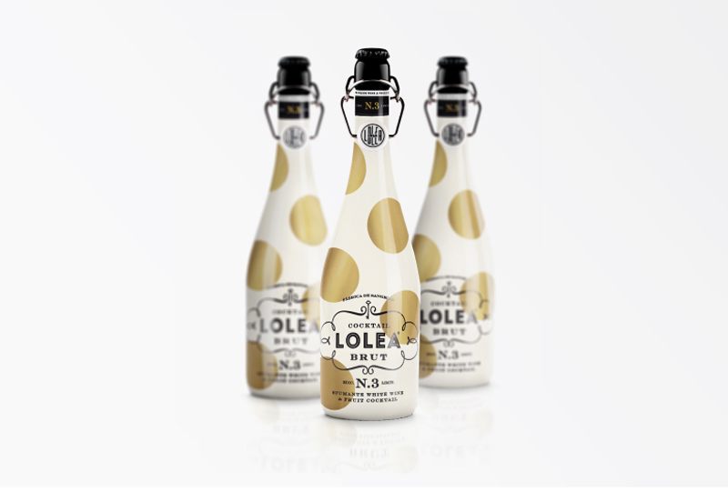


These traits are well captured by the youthful packaging characterised by a clear background with golden polka dots that remind the consumers of the bubbly character of the drink.
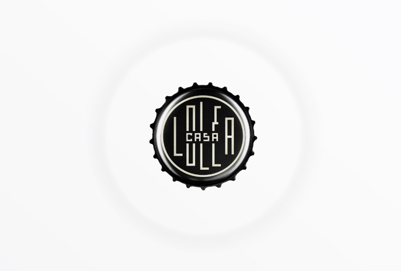
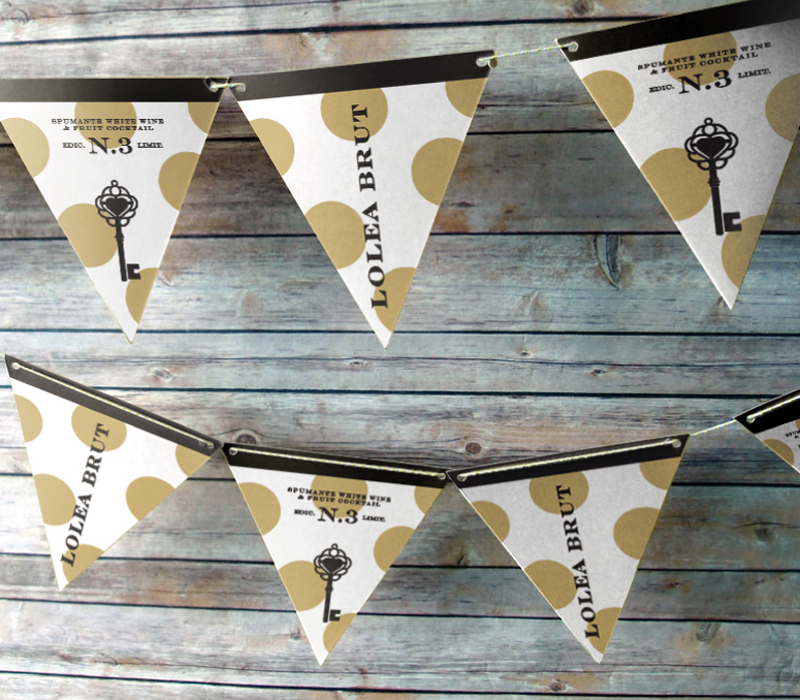
We are very impressed with the beautiful details of the packaging, like the elegant gold illustrations on the tag and the lovely bottle cap, and by the collateral material – such as the bunting.
Refreshing, summery and cheerful.
Designed by Estudio Versus
Country: Spain


