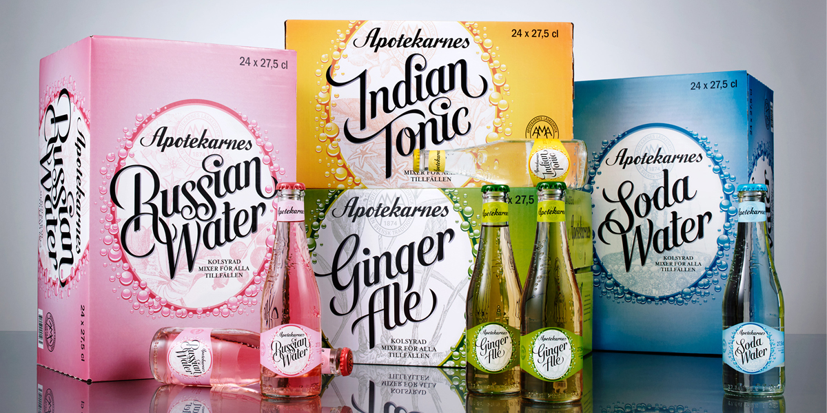
Have you ever heard of the Swedish soda brand Apotekarnes? I hadn’t and that’s most likely because I didn’t grow up in Sweden where it’s been popular for several generation with the young folk. But with the gorgeous new brand identity and packaging design just finished by the Swedish studio NINE , I’m sure they will be getting some worldwide attention.
In the past decade, Apotekarnes had lost it’s popularity due to the intense competition from global brands. NINE was approached to help revive the brand and work together with Apotekarnes in creating the packaging for a new range of drink mixers and sodas that would be targeted to an adult audience. A new demographic of consumers would need designs that would really capture attention.
“The strategy was to design a range that spoke straight to the hearts and minds of the target audience, to balance tradition and craftsmanship with the consumer behaviour and expectations of today within the category in terms of taste appeal – especially when competing with global market leading brands.”
The final packaging designs are striking! The color palette is made up of vivid, saturated colors that feel fresh and current. I have no idea what Russian Water is, but it looks delicious and I’d give it a try! What really stands out from the crowd is the hand drawn typography used for each flavor name. It’s a decorative and playful script that adds quite some personality to the product.