THIS IS IT! DIELINE Awards 2026 Late Entry Deadline Ends Feb 28
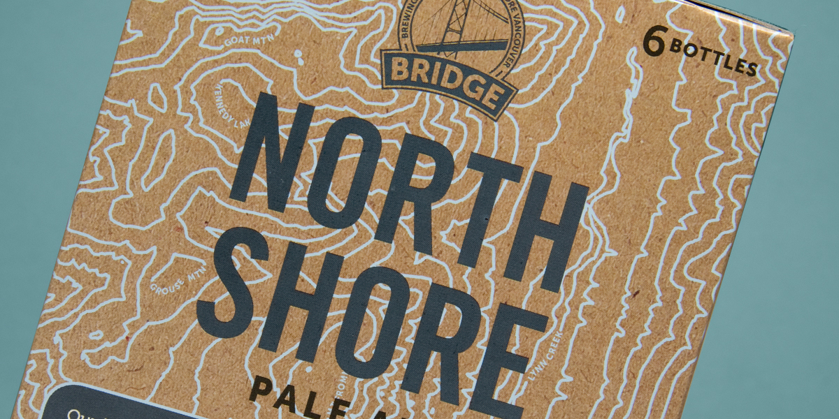
Bridge Brewery is a new craft brewery in North Vancouver, British Columbia who were facing enormous demand by their fans to move into six-pack packaging. To move forward with this task, they partnered with the team at Saint Bernadine Mission Communications Inc. to work on the design and brand system.
Saint Bernadine Mission Communications chose to honor the craft credentials of Bridge Brewing through the use of a craft paper texture for the box. The beer types are differentiated by color palette, each box using a different two-color combination. Working with all neutrals, it’s the high-contrast between the shades which gives the design a good punch.
“The naming conventions of their beers celebrate the popular outdoor lifestyle of North Vancouver by referencing local areas that are well trodden by mountain bikers, hikers, kayakers, skiers, boarders, and climbers.”
This localized reference of area names is reinforced by the use of topographical maps into the artwork. The maps are simple line art with key landmarks indicated, printed in a softer color so as to not compete with the typography. Not that there is a lot of type to compete with – Bridge Brewery keeps things simple. The beer names are large, bold and all caps, no frills and easy to read.
Get unlimited access to latest industry news, 27,000+ articles and case studies.
Have an account? Sign in