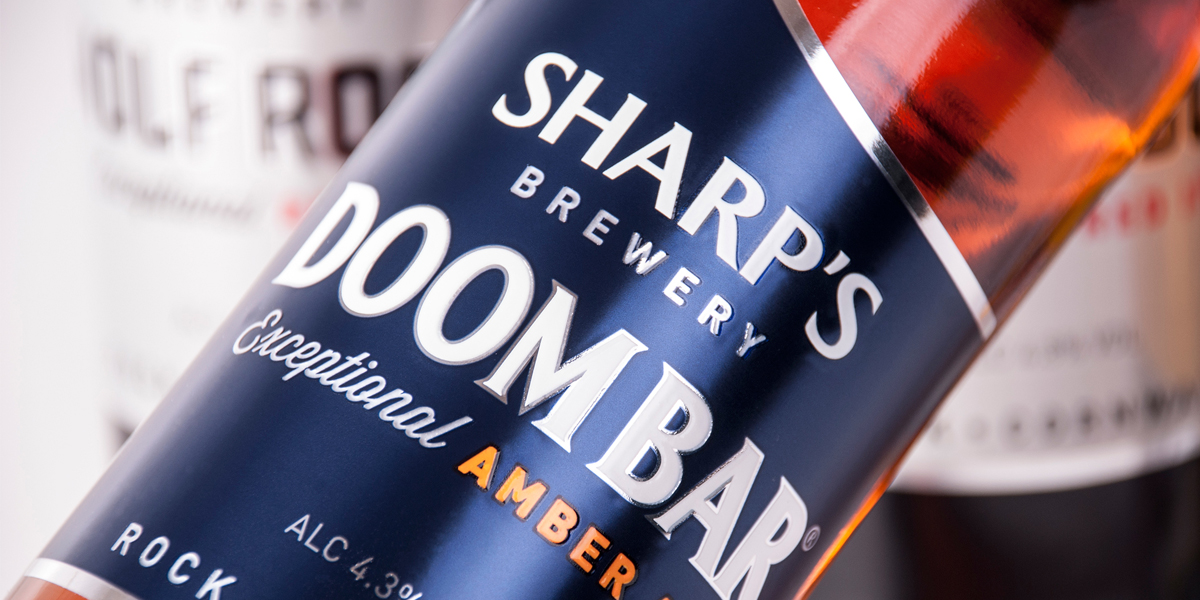
Sharp’s Brewery gets a new identity, compliments of Buddy Creative and their “wave” inspired branding and packaging design. Playing off Sharp’s tradition of relentless and progressive ambition, the team captures the natural energy of waves in their bold new symbol.
The distinctive off-centered wave shape helps create a cohesive brand look across all of Sharp’s beer brands. It also inspires a clean and memorable canvas for packaging and other applications.
At first glance, the design comes off as quite simple. The design elements are minimal, but it successfully makes a statement of confidence and experience, even for a relatively young player in the world of cask beers.