Concepts We Wish Were Real

Published

wdw.gif

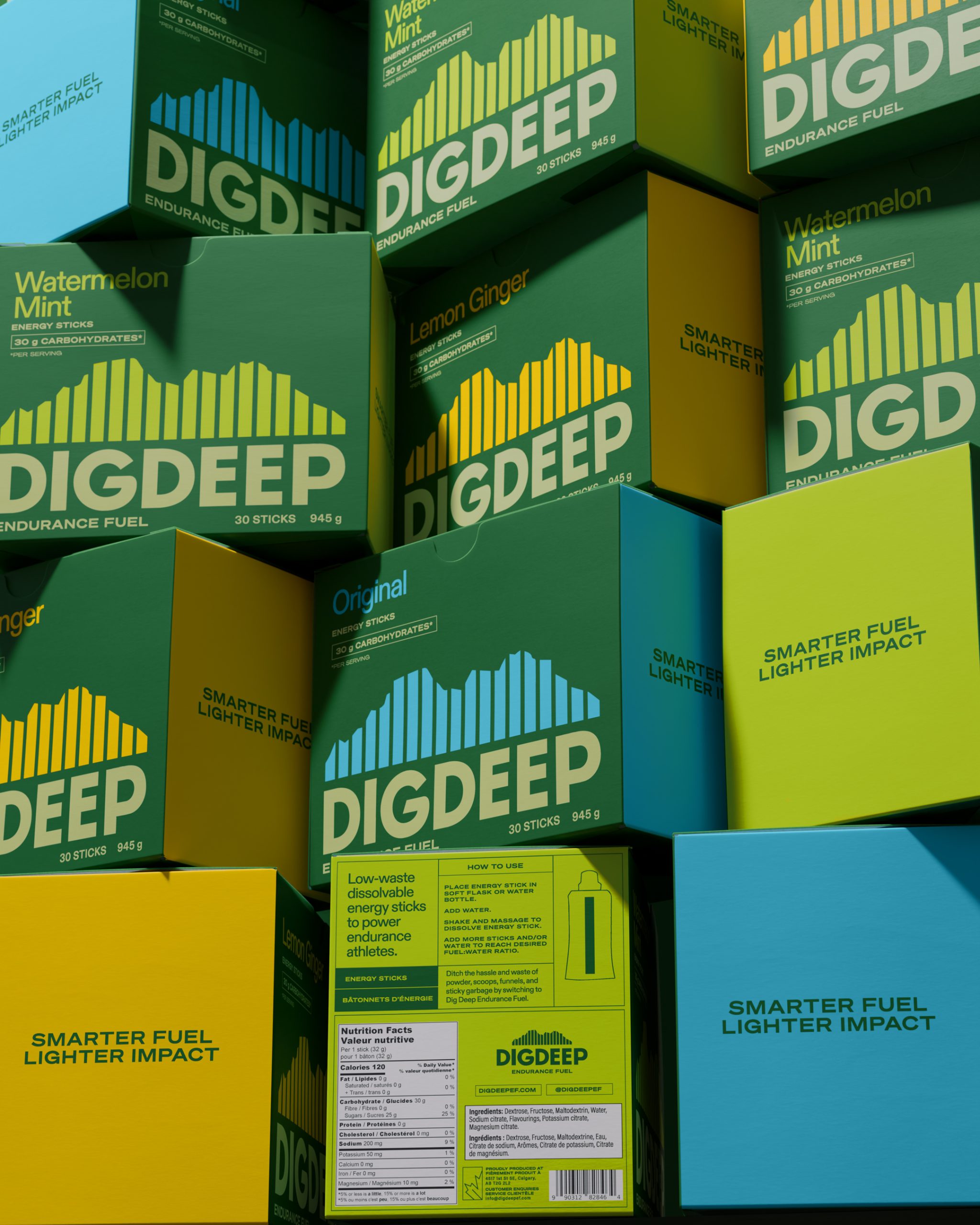
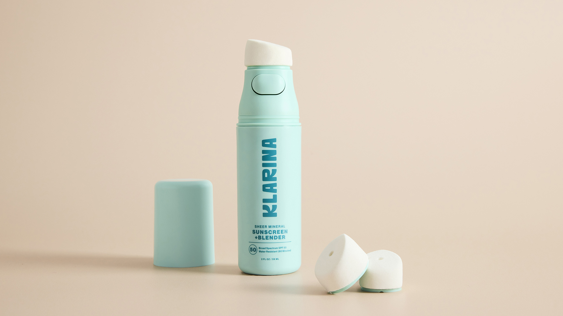
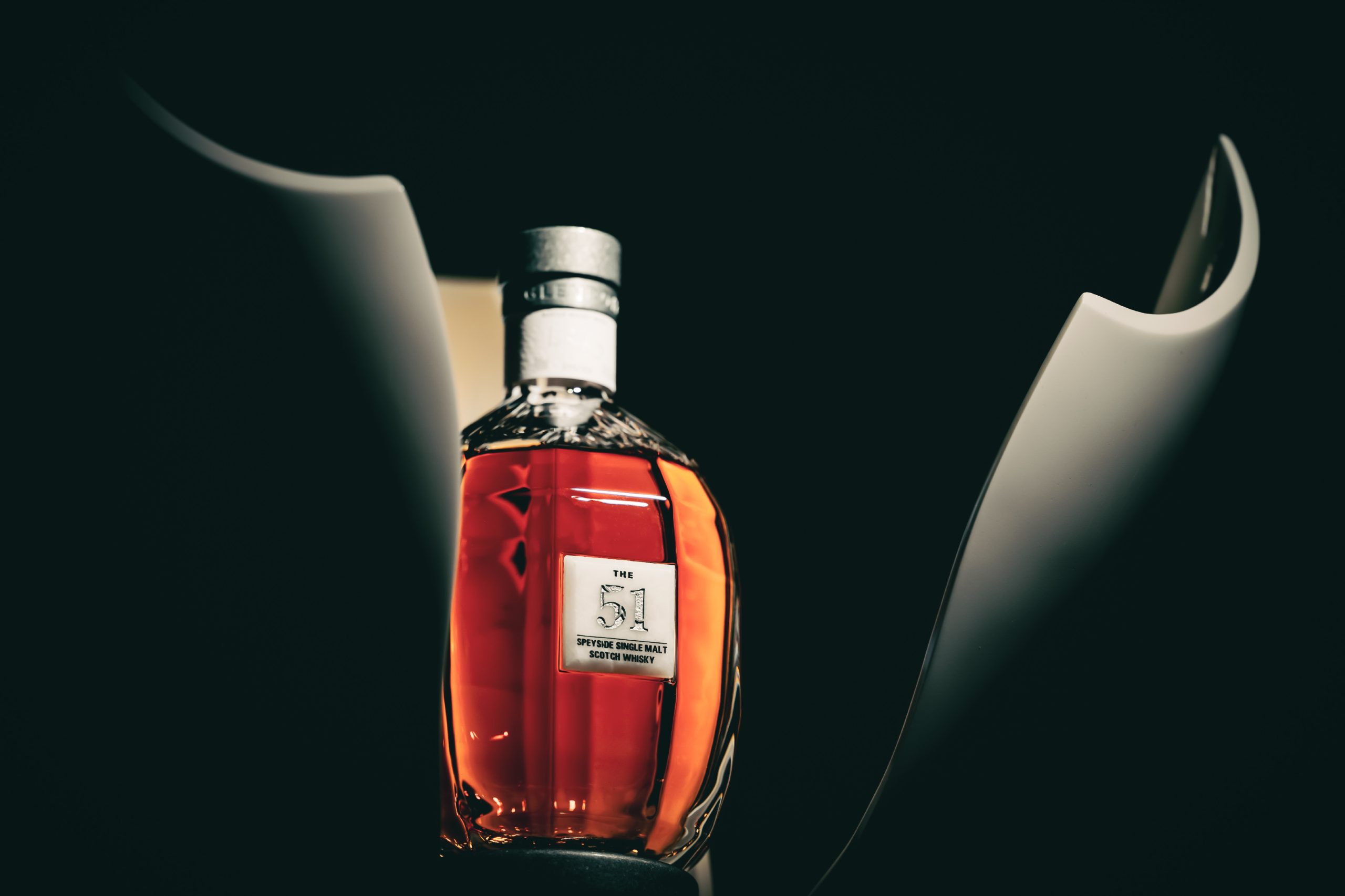
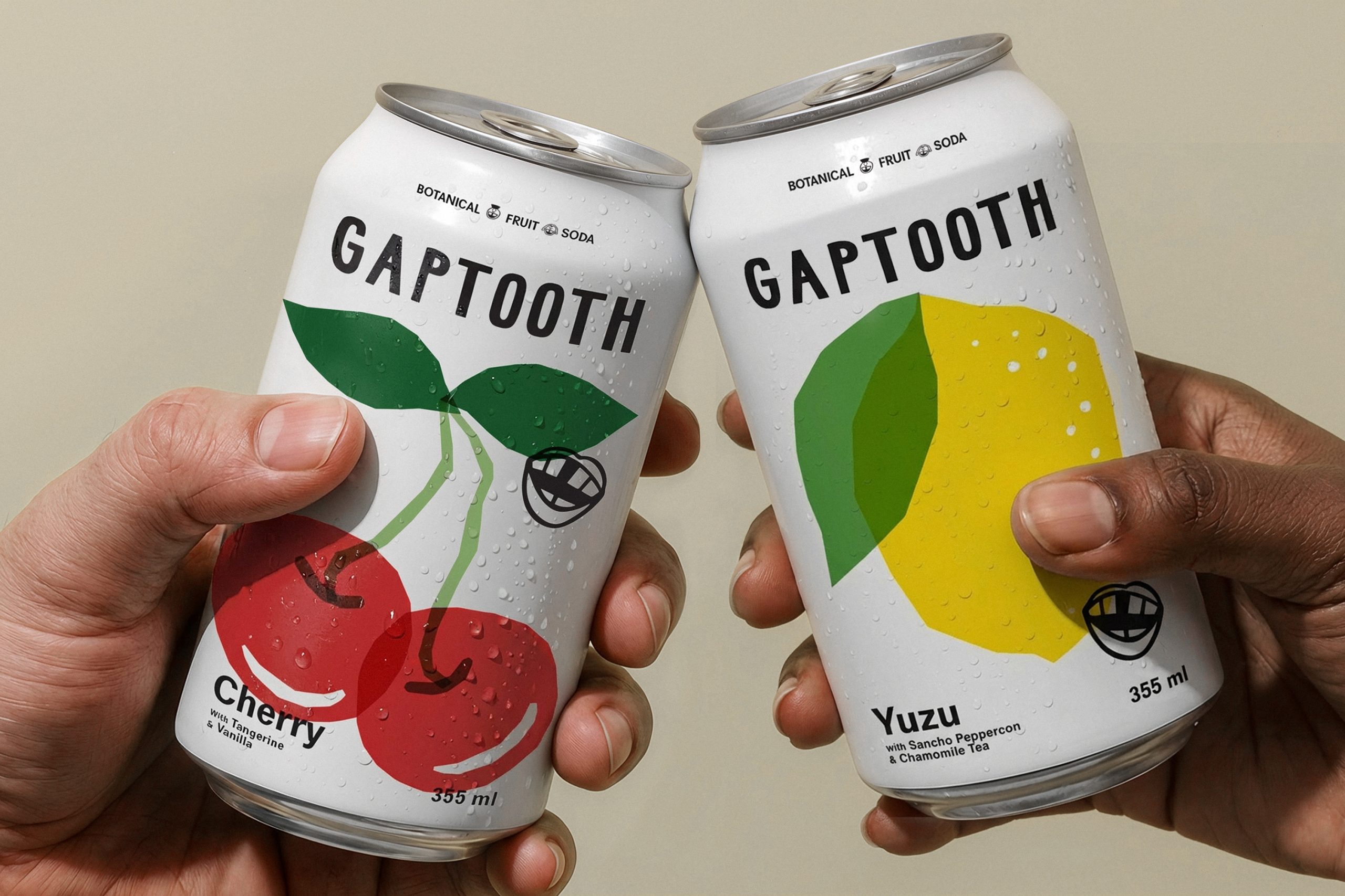
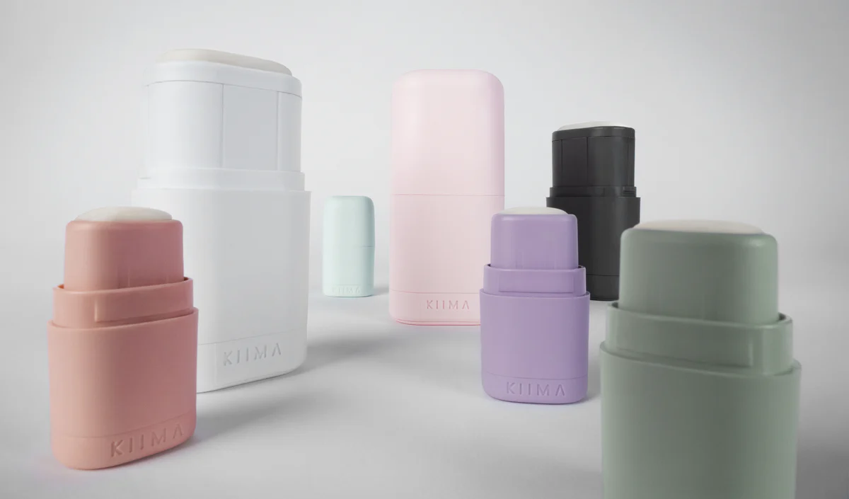
What better way to celebrate the end of the week than with The Dieline’s colorful and whimsical “Concepts We Wish Were Real”. 


Atmosphere

Concept

One mood, one tea. Atmosphere is a tea brand that is bringing a new concept to the table. Taking each of the four elements, the packs contain a blend of herbs that offer benefits for every mood. Paloma Martins designed the branding and packaging, using icons and coordinating colors to keep the brand simple and easy for consumers to find the one that best suits their needs.

Atmosphere comes in airtight cylindrical containers, keeping the tea inside fresh. Each variety has a clever name that implies the element it represents, like “On Fire” and “Fresh Wind.” The tea type is written in a tall and skinny sans serif font, and they all feature a representative icon. The tea lid features the logo, a geometric tree standing alone on a landscape that also looks like the letter “A.” Atmosphere allows the buyers to use their moods to indicate which tea to try, but also to choose a tea that can contribute to a mood they hope to feel.

Designed by Paloma Martins

Country: Brazil


SUGARLOVE

Concept

Craving something sweet? Check out SUGARLOVE. Designed by Alaa Abuamra, gourmet chocolate, gummies, licorice, and coca-cola flavored rock sugar are bagged in clean white pouches with a resealable top. The candy is magnified x100 so the consumer can gaze at the fine sugar crystal contained in every bite of goodness. Each candy is given a fun name such as friendly, fearless, or adventurist to spread positivity and love– hence the name SUGARLOVE.  

“Sugar Love is for customers with an unappeasable sweet-tooth. This package design has a strong brand, with a focus on the beauty of the actual product, infusing individuality and personality into each piece of candy. The minimalist approach that focuses on the character behind the candy creates a relatable and fun user experience.”


Designed by Alaa Abuamra

Country: Canada

City: Toranto


Frosty Jelly Ice Pop

Concept

In the mood for a frozen treat– Krizia Soetaniman has just the thing. Frosty Jelly Ice Pop with packaging inspired by the night sky. When the moon is bright, the light reflects off objects giving an ethereal look to them. This Cal Poly Pomona student recreates this moment on black ice cream bags adorned with small silhouetted illustrations of the stars, spaceships, and palm trees. This ice cream will surely make you feel like a kid again.

“We want to make an eye-catching, fun and simple design to an ordinary Ice pop .” I was assigned to design a new product from scratch by a group of Food Science students from Cal Poly Pomona for their final project. This packaging design concept for Frosty Jelly is a chalked based background with a striking ice pop in the middle which creates an eye-catching moment for the customers. The main focus was to make sure people would want to buy the product by just looking at the cover. “Don’t judge a book by its cover”. 

Designed by Krizia Soetaniman

Country: Indonesia


Rosita-rose water

Concept

Rosita is a fictitious brand of rose water. The logo, which is like a seal, and the choice of a serif font give an artisanal look to the product however it is resolutely modern and feminine. The main colours of the flower, red and pink, create an interesting contrast between the softness of the rose petals and the power of their scent. Furthermore, the red attracts the eye thus giving the product a strong visibility. The clean and simple graphic identity showcases the purity of this rosewater.

Designed by JOAM

Country: France

City: Paris


OMMS – Organic Mexican Mayo Sauce

Concept

Personified packaging designs are always the best and this one is no acception. Conceptualized by Yang Ripol Design Studio, organic mayo is is placed in a white squeeze bottle with a cap in the shape of a Sombrero. The simple jester of placing a hat on the bottle adds an element of humor to what can be a boring product. 

“This is a packaging for an organic gourmet sauce which is not produced. It aims at interpreting the spicy sauce, which often appears rustic and folkloric, by incorporating a minimal and essential approach both in its package and graphic image. The pure, delicate look reflects its organic origin and the unique speciality blend of ingredients. The iconic and humorous cap is a bold differentiator from the competition. 
Three variations of flavor are differentiated by the color of the cap, all based around peppers.”

Designed by Yang Ripol Design Studio

Country: United Kingdom

City: London


Lava Soap

Concept

This package design uses the opportunity of Lava Soap’s upcoming 125th anniversary (2018). These packages utilize a fresh box design that orients the package vertically for the first time in Lava’s history, reflecting Lava’s iconic volcanic logo. By resurrecting past package designs from the 1800s-1980s to call back to the heritage of Lava’s 125 years of clean. These packages will be released during a one-year promo, with a new package being introduced every 2 months.

Designed by Logan Hamblin

Country: United States


This placeholder is removed when the ad slot is configured.

This placeholder is removed when the ad slot is configured.

This placeholder is removed when the ad slot is configured.

This placeholder is removed when the ad slot is configured.

This placeholder is removed when the ad slot is configured.

This placeholder is removed when the ad slot is configured.