
Similar to the instruction pamphlets you receive from your new Ikea furniture, the branding for Stoiver building mixes relies on visuals and images rather than text to get its message across. Designed by Vozduh Advertising Agency, Stoiver’s bold approach is unapologetic and effective way to communicate with buyers.

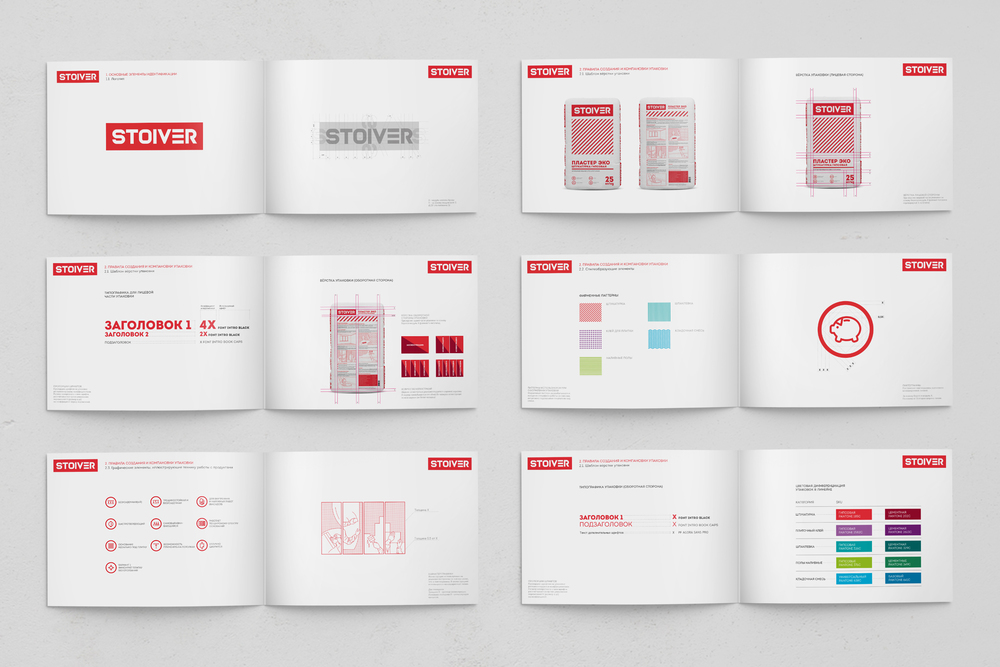
“Our Agency has developed the identity of a new brand of dry building mixtures called Stoiver. For the new brand, aimed at a wide audience, we chose a modern laconic visual image. The consistent and convincing font in the logo emphasizes reliability and simplicity. The original version of the letter ‘E’ symbolizes the connection of the product with surfaces. With the development of a range of packaging, special attention was paid to creating an identification system within the product categories of the brand. Each category has a unique texture and color solution.”


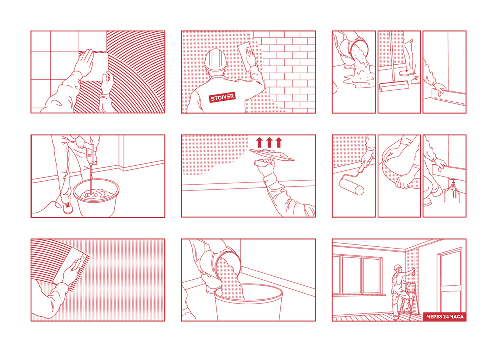
Inevitably when you purchase and use materials like this, you’re left with a lot of questions as to how to use it. Vozduh solves this problem by letting consumers be more engaged visually from the start. An identification system using bright colors and patterns helps to discern each product, and instructional images show much more detail than what words are able to. The images take the buyers along on a journey and making the end result more attainable, thus inspiring them to create things with Stoiver.


