
Celebrate this weekend with our colorful Concepts We Wish Were Real.
Kiviks musteri
Student

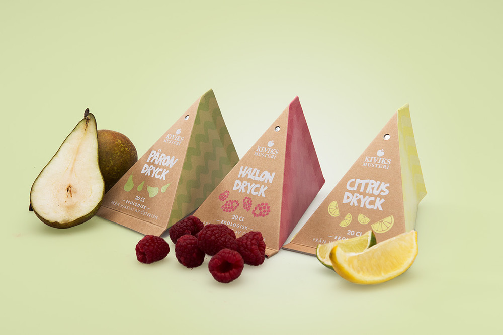
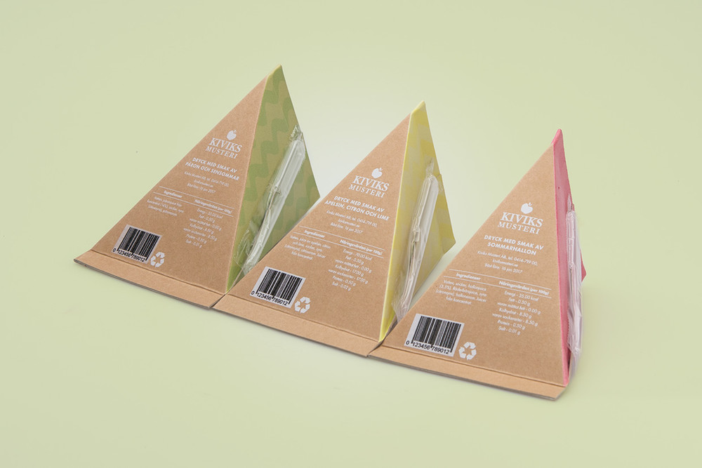


These juice boxes are absolutely the talk of the town! Conceptualized by Johanna Brännström, organic, freshly squeezed juice is packed into adorable triangular-shaped pouches lined with aluminum foil. Fruit illustrations dance around the front of the packaging beneath the logo and juice name while a zig-zag pattern decorates the sides for an added flair.
“A school project where the brief was to launch a fruit drink package targeted to kids. The product is organic and should feel like a healthier choice than similar products. The solution is playful to attract the children but is also designed to appeal to the parents.”
Designed by Johanna Brännström
Country: Sweden
Stuck
Student


One of the most embarrassing things to happen is to get food stuck in your teeth, especially when you are out on a first date and want to make a really good impression. Where ever you are, toothpicks may not be readily available. That’s where “Stuck” comes in. Brightly-colored boxes contain individual paper folders, each with 3 flavored toothpicks. Grab a folder and slip it into your coat pocket and you’re paint the town red.
“STUCK is a fun brand for toothpicks. The name and also the design of the packages are inspired from the ultimate insight: We use toothpicks to get rid of the food that’s been stuck between our teeth.
The logo is made from two teeth and a piece of lettuce between them. The reason I used lettuce is because it’s a more common picture, people having a disgusting leftover of lettuce in their teeth. The design of the package represents the mouth and the teeth in a minimalistic and a little bit caricature way.”
Designed by Dimitra Karagianni
Country: Greece
Herbesoul : Garden Kit
Student


If you’re into gardening and are a DIY king or queen, this may be the perfect thing for you. Designed by Malleka Singh and Samvidh Ramanathan, Herbesoul gives you all the tools to create your dream garden wherever it may be. With a simple step-by-step guide and a shovel at hand, you can have your own vine of tomatoes for a fresh spring salad or aromatic basil for that family pasta sauce you’ve been wanting to make.
“Herbesoul is a concept brand that promotes indoor gardening for the urban living culture. It is a DIY kit that contains one tool, 2 seed packets, one plant food packet, coco peat, a pot and a base plate. The outer package is reusable as a storage box making the kit sustainable.
Through our packaging we have tried to build the very hobby of growing plants by promoting a well-equipped kit for a beginner to understand and follow. Our idea was to promote the whole concept of indoor gardening by packaging the basic necessities for an amateur learner. We have gone for an extremely modern and contemporary look targeting the urban living.”
Graphic Designer: Samvidh Ramanathan
Product Designer: Malleka Singh
Country: India
MARINE
Student


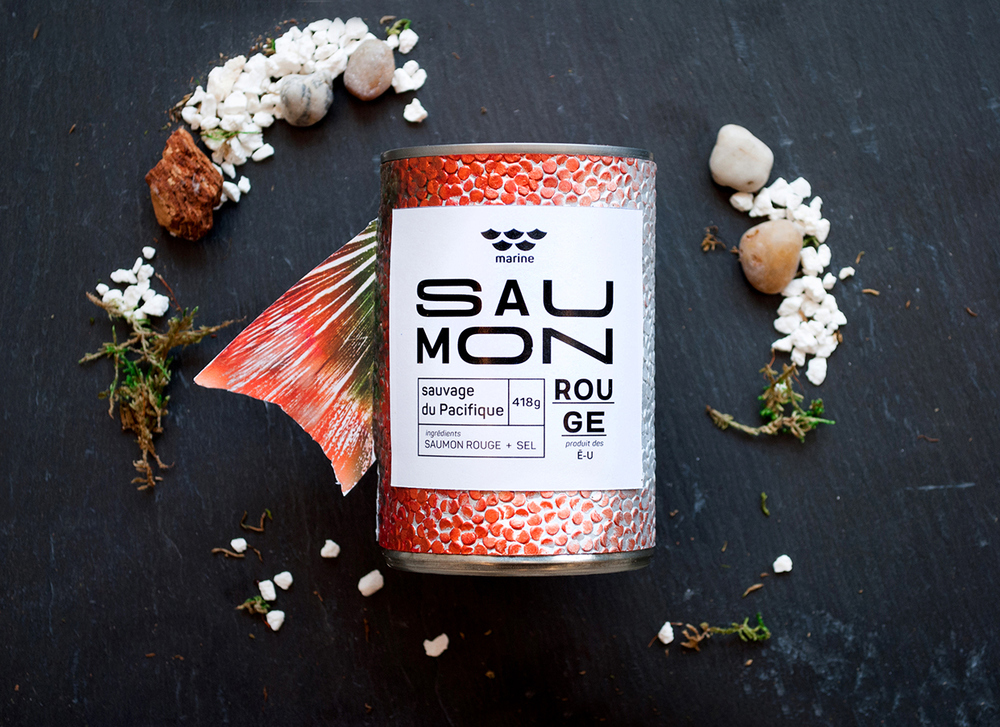


Canned fish isn’t always the most appealing choice when figuring out what you want to eat for lunch or dinner. Fresh fish is always the better option. But if canned seafood looked like this, I would definitely have to give it a go. Designed by Yen Vy Vo, Dang Vo, aluminium cans are stripped from their ribbed metal surfaces and replaced with an ombre of fish scales. A stark white label gives the design contrast while a synthetic fish tail sticks out from the side. The overall design is playful and wacky and looks like it belongs in a novelty store.
“Branding and packaging design for Marine. The design inspiration comes from its own products. The distinguished features of each fish are brought forward by the bold design and realistic texture. This also highlights the freshness of the products.”
Graphic designer: Yen Vy Vo, Dang Vo
Photographer: Evi Jane Kay Molloy
Country: Canada
Mr. Ping
Concept


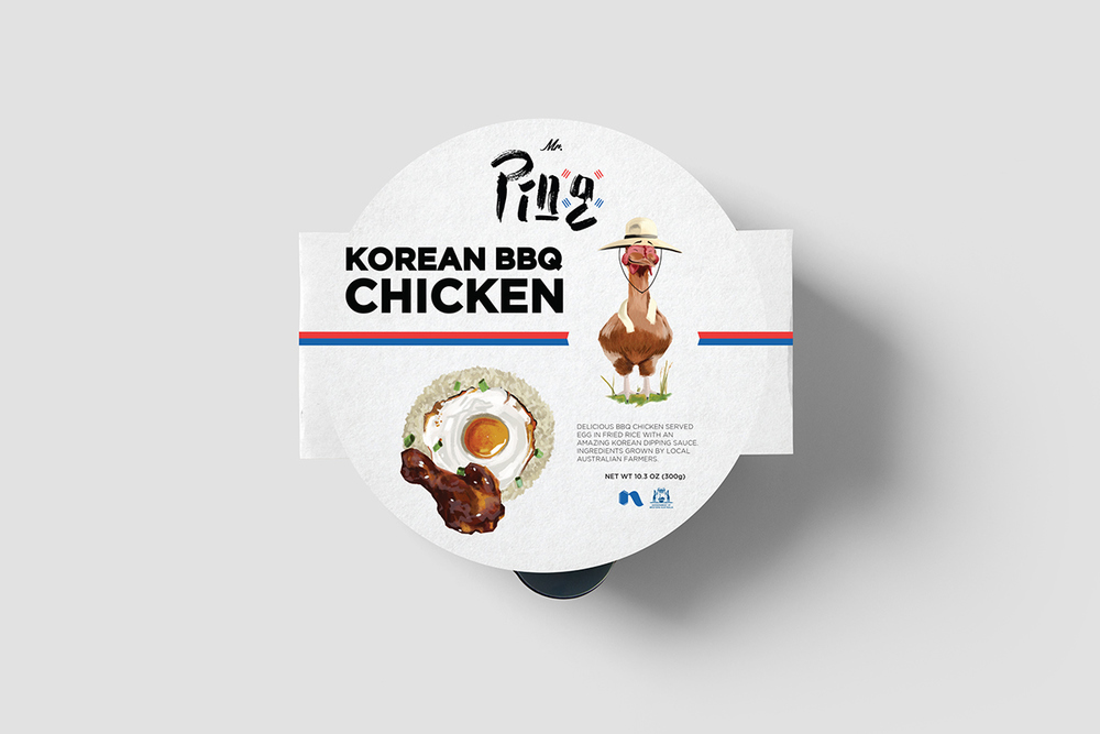


For an easy, on the go meal that fills you up and is delicious, try Mr. Ping’s. Designed by Dominic Sakalauskas, steamy Korean bbq can now be enjoyed in the privacy of your own home in less than 5 minutes. Sleek black microwavable bowls are dressed in a white sleeves garnished with the Mr. Ping logo, a food illustration and the amiable chicken mascot.
“Mr. Ping is a South Korean food company that prides itself on providing fastmeals that bear cuisine recipes of its countries diverse and rich in flavour dishes to people who appreciate mouth watering, tasty and authentic food.The kitchen is Korean, however the ingredients are grown by local farmers that are DAFWA approved.”
Designed by Dominic Rios Sakalauskas
Country: United Kingdom
U&ME BEER
Student


Bold, edgy, and urban is the best way to describe this fictional redesign. Conceptualized by Kalle Lund, U&ME beer is designed to pack a punch with an array of saturated colors. The logo is reconfigured to give the brand a more masculine vibe while staying consistent with it’s roots.
“This is a self-initiated project where I decided to redesign the logo and labels for one of Swedens smallest breweries; U&Me Beer from Umeå. I wanted to avoid the design of typical beer labels and used colors that would stand out on the shelves. Also, I wanted to find an innovative way to fix the labels onto the bottles and therefore, I saved an edge for the especial look.”
Designed by Kalle Lund
Country: Sweden


