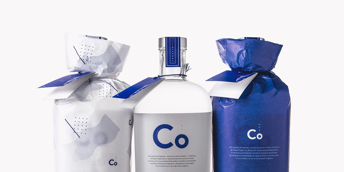
Here’s something new from the Douro region, usually known for its wines. With packaging designed by Koiástudio, this Portuguese gin takes a crisp and refreshing approach.
“Inspired by its name and origin, we’ve mixed in this package a sense of modernity with a tendentiously conservative – and glamourous – imagery of the Douro. With a classic visual structure, the technical language proposed by the fictional chemistry element ‘Co-17’ adds charisma to the package. The cobalt blue pops up as a chromatic connection between this ‘chemistry element’ and the Douro river.”
For those who love crisp and minimal designs, Cobalto-17 is an absolute dream. The striking cobalt is used sparingly and the text is a modern sans serif, combining beautifully for a bold yet understated gin. The chemistry element elevates the brand, appealing to those looking for a unique spirit or hoping to create craft cocktails.