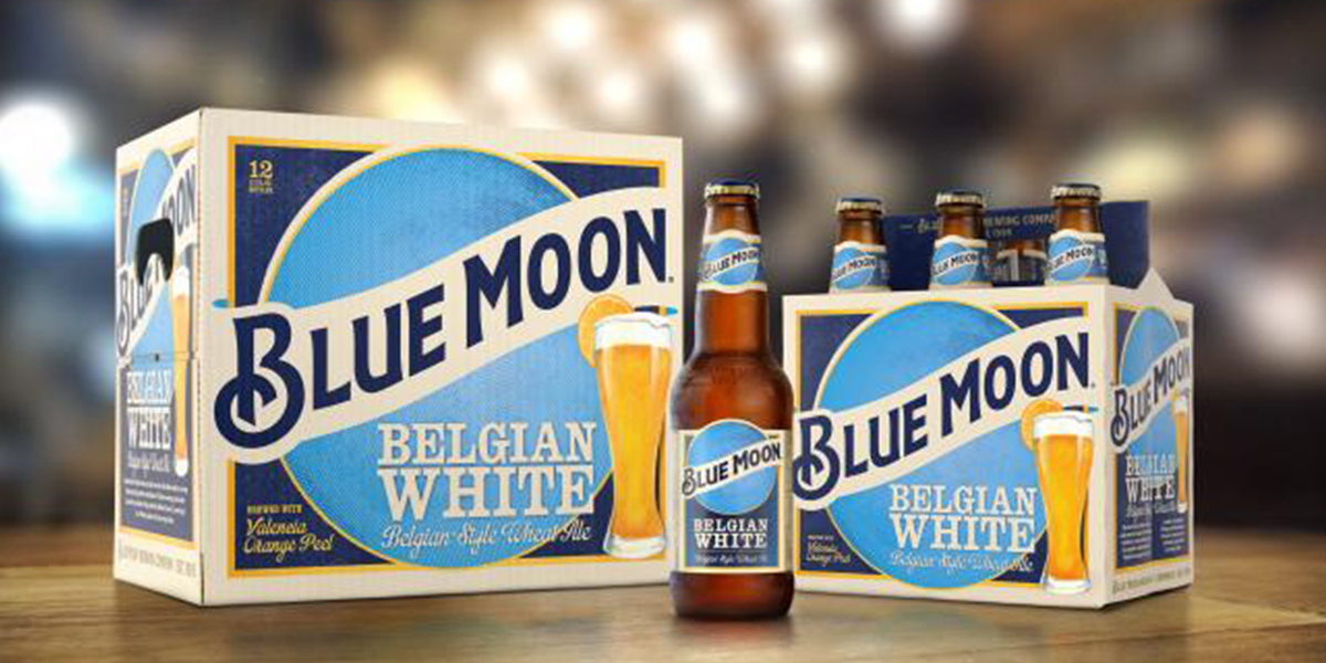
A recent feedback from consumers leads Blue Moon to redesign their packaging. With efforts to create a brand identity that is more inviting and leaves drinkers on a positive note, the mysterious landscape of the blue moon rising over a forest will be removed to make way for a larger moon behind a tall glass of beer. In its most significant design overhaul since the brand launched in 1995, Soulsight’s goal is to strengthen the brand and raise sales by tying the packaging to bar rituals that put Blue Moon on the map. The redesign will hit stores in April 2016.
Presently, “there is a bit of disconnect between the brand that [drinkers] know and love on-premise that is bright and inviting and really creative with the glass and the orange,” said Ashley Selman, senior marketing director of Tenth and Blake, which is the craft and import beer division of Blue Moon-owner MillerCoors.
OLD DESIGN