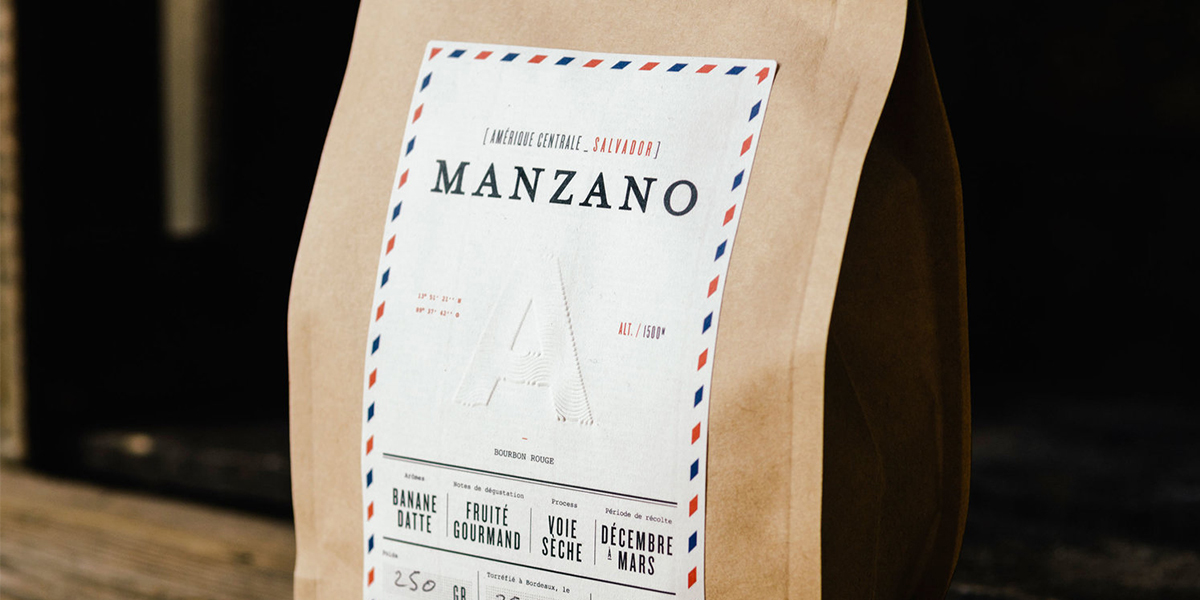
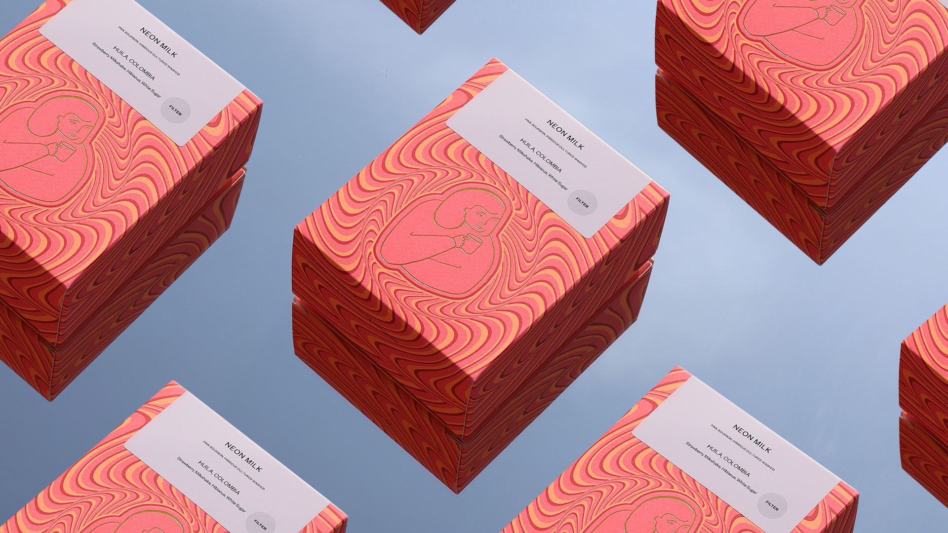
A coffee that has a great amount of love and care go into it must also have the packaging to match. James Bertrand focused on this when designing the branding for l’Achimiste—which translates to ”The Alchemist.”
“Visual identity and declination of branding of l’Alchimiste, a French coffee-roaster. The packaging is a key declination for this project. My aim was to show the passion he put into his work and the finest selection he made for his coffee. The excellence, the knowledge of its product must be reflected through the packaging.”
The branding for l’Alchimiste looks like an absolute treat and the perfect way for someone to get themselves a truly divine coffee. Browns, whites, and blacks give the brand an earthy, homemade feel, and a thin sans serif font appears modern and crisp. Small details, like embossed letters or fine borders, emphasize the premium quality of the brand. l’Alchimiste possesses an air of simplicity about it with clean and orderly packaging and materials. Through this, the buyer is able to focus on the beauty of what they buy, such as the rich flavors and aromas to give them a complete experience.
