The Life range of fruit juices entered the marketplace two years ago, and have struggled to carve out a presence on the store shelves since day one. Their packaging design followed the expected formula of showing photographs of oversized fruits, bursting open with juiciness and vibrancy. Unfortunately, this art direction blended right in with the sea of competitors. Only two years old, Life Juices made the bold decision to redesign their entire line of packaging. The main goal – a strong shelf presence that would capture the consumer’s eye.

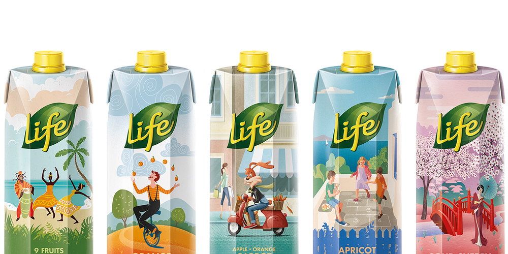
Life Juices chose to work with the designer and illustrator George Probonas, who would be responsible with creating a custom illustration for each of the ten juices in their line. The key concept was to create visually interesting stories about the fruits, based on their colors and common themes associated with each. Probonas must have a wild and vivid imagination because the range of storytelling he created is pretty fantastic.
“The design brief focused on shelf stand-out through a creative reinterpretation of the conventional design codes.”


Top of my list of favorites is Mandarin Blood Orange, with what appears to be children parachuting down from the sky. The twist here is that the parachutes they hang from are mandarin oranges, with their little stem and leaves spinning like a top in the wind. The color palette features beautiful shades of oranges and complementery greens, and far-off in the distance you can see the small village the children come from. Who are these children? Why are they playfully parachuting? What’s in that small village in the background?
What a variety of scenes Probanas’ has created for the different juice flavors. You can see a peach setting like the sun, a cartoon bunny riding a vespa down the street with a basket filled with carrots and a man riding a unicycle while juggling oranges with ease. And, I’m so impressed with the fluidity that the wide range of subject matter has when all placed together as a family.
“The brand design has also led to communication which exploits the visual storytelling on the juice cartons.”
There is no doubt in my mind that this fresh style will catch the consumer’s eye and be a stand out on the shelves. Each juice telling it’s own unique story that not only captures attention, but also invites the consumer in to discover the story unfolding before them. Life Juices took the bold step to redesign their packaging, which we all know is an expensive move, but the payoff seems to be worth it.


