Featured image for Conca Panamericano Vodka x Dig Deep

Conca Panamericano Vodka x Dig Deep

by Elizabeth Freeman on 10/22/2015 | 3 Minute Read

Editorial photograph

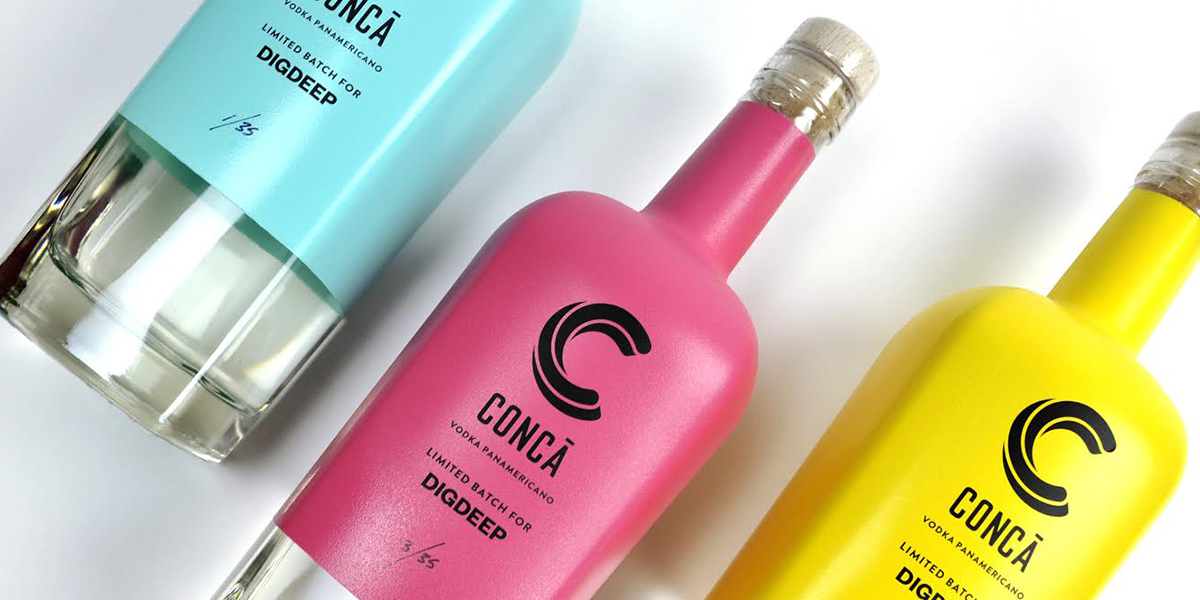
The Yellow Loft teamed up with Dig Deep & Conca to create packaging for Dig Deep's Conca Panamericano. This vodka is special in many ways as it is a symbol for what Dig Deep stands for– sending a pertinent message that "every drop counts". 

Dig Deep partnered with LA-based event design company Kindred & Choice to host an Empty Pool Party, where the beverage was dispersed, to draw attention to California's dire water situation. Although there was no swimming involved at this "pool party", there was plenty of delicious food, live music, and Vodka, lots and lots of Conca Panamericano Vodka.
Now, how was this Vodka produced you ask? Dig Deep collected water from the pool, that otherwise would have been drained, purified it, and made it into vodka with the help of Absolut. This crazy idea went viral and had, Save the Drop, KindBoxed Water, among others, wanting to participate in this project any way they can. 

With that in mind, The Yellow Loft needed to create a bottle that would best represent the project wholeheartedly. Distilled using corn, sugarcane and re-purified pool water, the vodka was placed in repurposed glass bottles.

The overall project proved rewarding and helped bring awareness to the water crisis we are in. Brigitte La, Designer from The Yellow Loft, speaks on what it was like collaborating with a non-profit organization and what challenges arose during the process. 


Editorial photograph

1. What are some of the challenges of this project?

The major challenge with this project by far was the timeline - we were presented with 35 bottles that needed to be labeled and picture perfect for an event a week away. The time constraint and quantity created limitations as to what processes we could use to spruce up these bare bottles. The beauty of the situation is that because we had to act quickly, there wasn’t much time for second-guessing or finicking with the design. 


2. What is unique about the packaging?

Besides the uniqueness of the product itself, the design was very hands-on. The process involved stripping the bottles of the old unusable labels, masking off areas to be flooded with color, measuring and placing the bottle deco and labels - all of this done by hand. We created bottles in four different color ways and each one has been editioned and numbered by hand.


3. How does the nature of the project drive your design and where do you find your inspiration?

We had to act quick and instinctually and decided our priority for this project was to highlight the brilliance of the product - vodka that takes water conservation to the next level, created by purified pool water that would otherwise not be used. Using the 90’s inspired color palette from the Empty Pool Party, we flooded each bottle with one of four colors, leaving the bottom portion exposed to showcase the clearness of the product. 

Editorial photograph

4. What was it like collaborating with Dig Deep on a water conservation project and how was it different than working with other clients?

Working with Dig Deep was a blessing: they gave us full trust and creative freedom. It’s not every day that a project like this comes together. As a studio, it was all-hands on deck to create something that was part of a bigger cause: to contribute to a greater social awareness of the drought in California and importance of water conservation. 

5. What are your key takeaways from this project? 

We’re confident that we can move and act quickly. Given creative freedom and the full trust of a client, we are able to be nimble.