Here at The Dieline, we love tasty chocolate just as much as we love beautiful packaging and so, looking at the work developed by Denis Lelic really put us in a good mood.
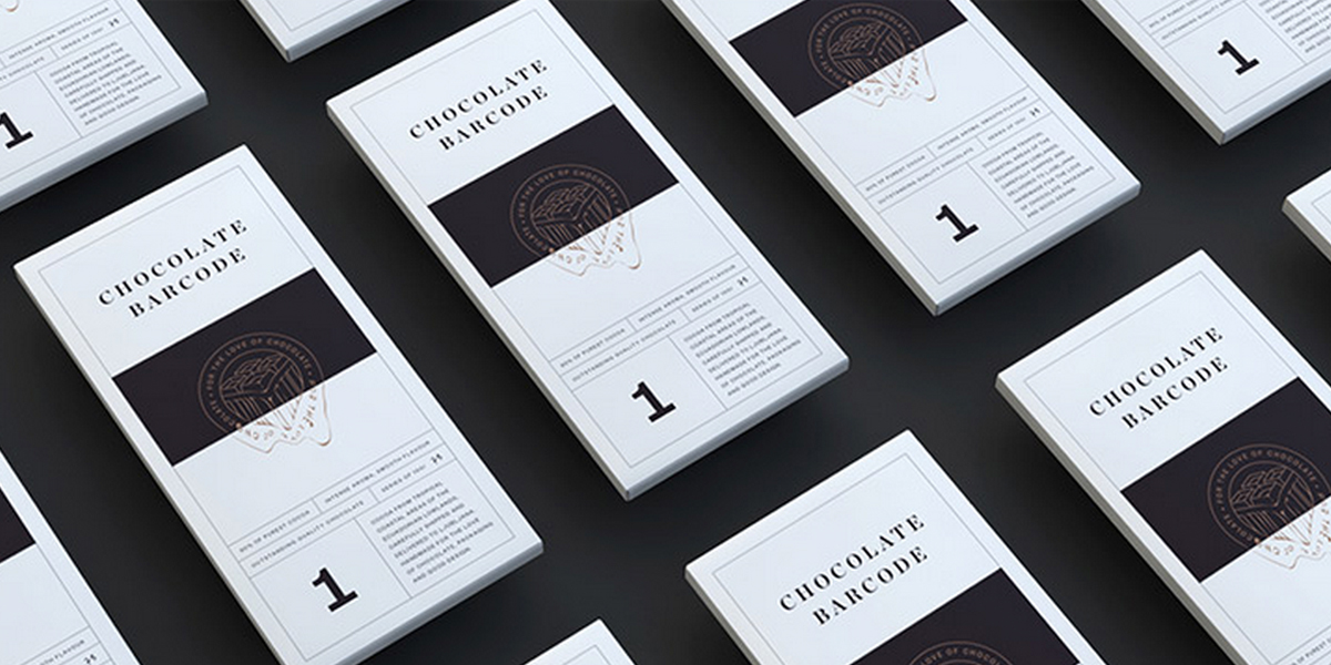
Chocolate Barcode is the name of a very premium limited edition chocolate run and the Slovenian designer created its brand identity and packaging.
The brilliant name plays around the word “bars”, whether these are chocolate bars or barcodes. The outer packaging brings this wordplay to life with the use of black and white tones and minimal, linear graphics. The logo represents a piece of chocolate that melts into the lines of the barcode.
However, the real wow factor is the interior of the packaging.
“The inside of the packaging is where the magic spark happens and it brings the special momentum to it. Red sided barcode lines are applied to make a contrast to the minimalistic outer side.”
A great use of logotype and layout and, above all, a very interesting development of the inner pack. Hopefully, the initial 100 pieces produced for this promotional launch will lead to a bigger production.


