Featured image for #Safepods

#Safepods

by Dieline Author on 01/22/2015 | 4 Minute Read

Editorial photograph

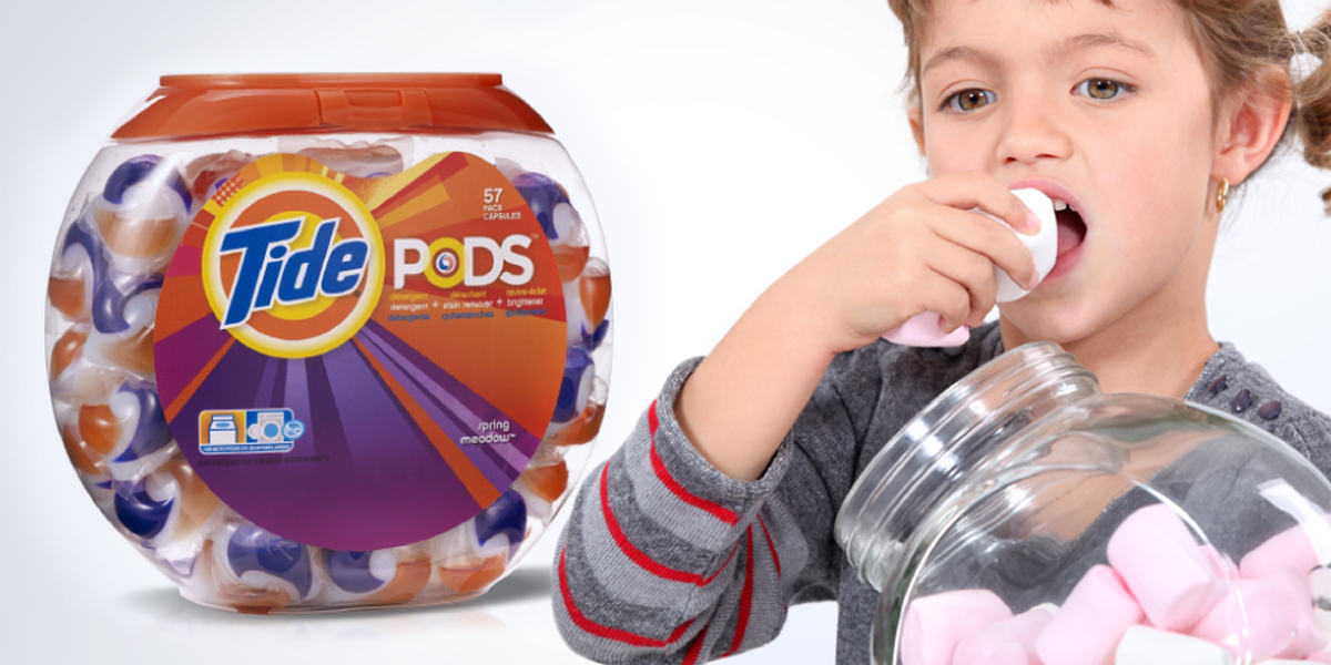
Detergent pods look like candies and attract children. Already 17,000 have ingested, inhaled or touched the content. Can design solve this problem?

Between the introduction in 2012 of detergent pods and the end of 2013, 17,000 children under the age of six have ingested or inhaled the detergent contained within the pods, or sprayed it in their eyes. (*Detergent Pods Pose Risk to Children, Study Finds, NYT 10/11/2014).

Editorial photographEditorial photograph

How to use the design to make them safer?This is the question we posed in CBA, always ready to seek answers to real problems through the use of design thinking. Convinced that projects designed with heart can make the world a better place, we have developed innovative packaging solutions for single-dose detergents.

Editorial photographEditorial photograph

How to prevent a single dose capsule from attracting the interest of a child?The current packaging of single-dose detergents have attractive lines, soft textures, small size and flashy colors, just like the toys or sweets. It is this that attracted hundreds of children and this is what has led us to develop, starting from 3 very simple concepts, some packaging solutions that drive away children from the contact with the capsules.

Editorial photograph

1. DON’T LIKE (broccoli pods)? Children eat detergent pods because they look like sweets.? Children don’t eat vegetables.? What is the most disgusting vegetable to a child?Children will not eat pods in the shape of broccoli.

Editorial photographEditorial photograph

2. DON’T CARE (patch pods)? Children are attracted by colours but often ignore neutral, boring objects.? Children would ignore pods shaped like simple grey sheets.Children have small hands.

Editorial photographEditorial photograph

3. DON’T SEE (pods dispenser)? It only takes a second for children to grab anything in their reach.? Children are safer if the pods stay in Mum’s hands.A single-dose dispenser would keep the product out of the sight and reach of children.

Several American Associations for the protection of children invited the detergent pods manufacturers to review the design of their products, believing that the root of this problem lies in the appearance of the products. Here in CBA, through this challenge, we want to stimulate dialogue and the search for solutions, because we believe that common sense, greater attention and an aware packaging design, can help to reduce the number of home accidents involving children.What do you think about this? Join the conversation by expressing your thoughts on social media via the hashtag #SafePods.


Editorial photograph

Gianfranco Siano joined CBA group in September 2008 during the renovation of the Italian office. Starting from January 2012 he took the responsibility of the Italian office, leading the organization to strategic and creative excellence.

Previously he worked for Landor as Senior Designer and subsequently for Robilant Associati where he held the Creative Director position in the Corporate Branding department. 

Some clients he worked for : Fiat Group, Telecom Italia, Luxottica Group, Autostrade per l’Italia, Fideuram Bank, Mondadori, Percassi, Wine House Zonin, GiGroup, Bolton Group, S. Pellegrino, De Cecco, Lactalis Galbani.

Read the full article here More info: press@cba-design.it


CBA Italy, designing brands with heartCBA is a branding agency. We help our clients to generate value through design. Sometimes a different point of view is all that is required to find the solution. Lateral thought, intuition and passion are our qualities.www.cba-design.it