Pereg – Quinoa Pops

Published

Filed under

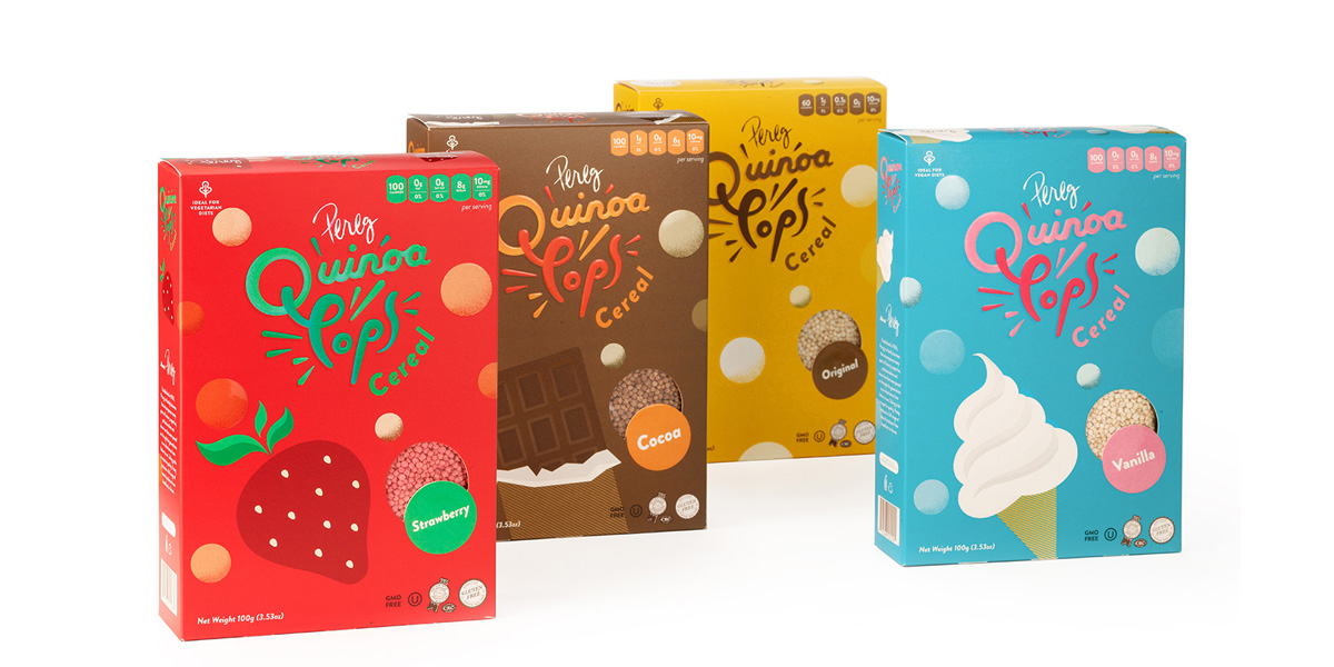
‘There is something exciting and thrilling about designing a product that does not exist yet. Something that has no history in the market–and that was the case with Quinoa Pops. 
Quinoa Pops is your new breakfast cereal. It is similar to popcorn or a puff, except this pop uses all natural quinoa. 
The first step was coming up with a name—a name that was catchy but also described exactly what the product was for. Something totally obvious, but new. ‘
The design agency, Squat New York, wanted to project the quinoa pops as this bubbly, fluffy ready to eat cereal. To portray this, they designed the packaging in such a way that would properly convey the various ways the pops could be used just by looking at it on the shelf. They wanted the package reflect feeling of joy while eating the cereal; touching upon all five senses, especially taste. 

Squat New York created unique color patterns that would appropriately express each flavor of Strawberry, Chocolate, Vanilla, and Original. They then combined these colors with illustrations such as, a strawberry or a chocolate bar to further enhance the consumer’s understanding of the actual flavor. 

Unique typefaces were created using calligraphy. To resemble the true effect of the pop, they designed the font to look three-dimensional with a raised texture so that when you touch it, you can feel that it is elevated. Along with the font, we took things a step further and added explosive lines around the words Quinoa Pops to further connect and entice consumers of what the cereal is and what it represents.  

This placeholder is removed when the ad slot is configured.

This placeholder is removed when the ad slot is configured.

This placeholder is removed when the ad slot is configured.

This placeholder is removed when the ad slot is configured.

This placeholder is removed when the ad slot is configured.

This placeholder is removed when the ad slot is configured.