Featured image for Concepts We Wish Real

Concepts We Wish Real

by Ivan Navarro on 09/12/2014 | 10 Minute Read

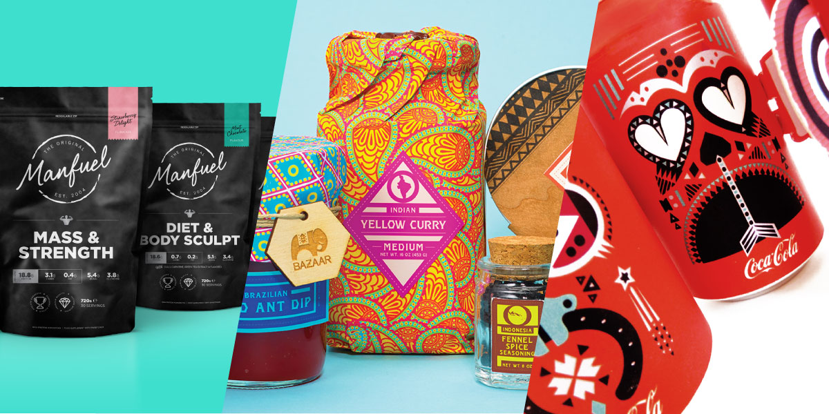
A Coca Cola concept that stacks to create a totem pole, A Brooks Brothers collaboration with Swedish Candy, and a Trader Joe's private label project are all part of today's concepts we wish were real! 

Coca-Cola Lovely Totem 

Concept 

Editorial photographEditorial photographEditorial photographEditorial photographEditorial photographEditorial photographEditorial photograph

"This project is a fictional work of a limited edition for Coca-Cola. Each can carries a set of lucky charms: happiness, money, luck and love. The four cans can be assembled to form a protective totem."

Design by Delphine Marie GrossetLocation: Paris, France 


Manfuel

Concept 

Editorial photographEditorial photographEditorial photographEditorial photograph

"Packaging for Manfuel, a 'Performance Powder' manufacturer based in the Repulic of Ireland. Repositioning the Manfuel brand with a key focus on strength products, combining their experience in the powders market with their development of award winning flavor production."

Design by Fifty3Location: England 


Brooks Brothers x Swedish Fish

Student

Editorial photographEditorial photographEditorial photographEditorial photograph

"The concept to this project was to take a brand that's known to be inexpensive and merge it with a far more expensive brand, in a way creating a collaboration. For this partnership, I've created a fictional trunk show, wherein Swedish Fish is the inspiration for a new line at Brooks Brothers, and the new line is called "Red Fish". Collaterals include: a trunk show invitation, clothing tags, and a redesigned Swedish Fish box." 

Design by Michael YatcoLocation: New York, NY


Minori Sake 

Student

Editorial photographEditorial photographEditorial photographEditorial photograph

"A second year project to package a product into a high-end target audience. The brand identity developed is called 'Minori' meaning harvest in Japanese. The cloudy sake references rice growers of the Niigata region."

Design by Michael NguyenLocation: Melbourne, Australia


Trader Joe's Brand 

Student

Editorial photographEditorial photographEditorial photographEditorial photographEditorial photographEditorial photographEditorial photographEditorial photographEditorial photographEditorial photographEditorial photographEditorial photograph

"Under Michael Osborne's Packaging 4 class, students of the Academy of Art University examined neighborhood grocery store Trader Joe's and reassessed its existing brand. The designers arrived at the solution to create an established store brand for everyday essentials at a value (Joe's Pantry), as well as private labels for the differing Trader Joe's demographics. Private labels include Muse, a beauty line consisting of pure ingredients for the natural woman, Equi, an innovative health product line for the health-conscious shopper, Bazaar, an exotic food line for the adventurous palette, and Little Joey, an trustworthy pharmacy line for parents who value honest products while caring for their infants."

Design by Melissa Gamo, Katie Mullins, Megan Myers,Location: San Francisco, CA


Tazo Tea

Student

Editorial photographEditorial photographEditorial photographEditorial photograph

"My love of tea led me to repackage Tazo's line of Well-Being teas. I focused on the teabag shape and function as well as the graphics of the packaging. The teastick eliminates the need for a stirstick or spoon,  making the product easy to use on the go. The consumer can be assured they are making the right choice by photos of the actual loose leaf tea on secondary packaging.  The jar containing the teasticks is a reusable container or can by recycled."

Design by Kat Manor Location: USA


Genové

Student

Editorial photographEditorial photographEditorial photographEditorial photograph

"The aim of this project was to restyling Genové, a dermatologic laboratory with more than 100 years of experience in pharmaceutical products creating a new structural design and a new graphic design. We created a new logotype to intensify the soul of Genové, you can identify the different products in the range by the color in the base of the bottle."

Design by Laia Fusté, Laia Truque, Paula Sanchez, Miriam Vilaplana.Location: Barcelona, Spain 


Urban Honey 

Student 

Editorial photographEditorial photographEditorial photographEditorial photograph

"JKR Juice Student Competition Brief 2013. Brief to create an a brand for urban honey, create the packaging, how it would look in the environment and the range it could be applied to."

Design by Hayley LowndesLocation: England