Golden Road Brewing Redesign

Published


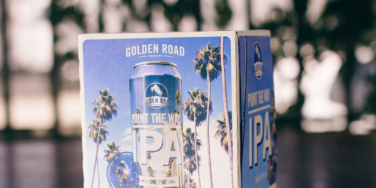
When you think of Los Angeles, Golden Road Brewing wants you to think of them. The three-year-old establishment that brews and cans out of its L.A. homebase wants nothing more than to be considered THE L.A. beer and its most recent packaging redesign certainly affirms that.

Meg Gill and Tony Yanow founded Golden Road back in 2011 with the mission to make it a part of L.A.’s fabric–and it seems they’re getting closer to their goal. The company now has more than 200 employees and expects to double the number of barrels it will produce over last year.

Since the brewery’s beginnings, iconic L.A. images (think palm trees, highways and sunsets), helped capture the ethos behind their brand. So it was only natural for a brewery that celebrates L.A. to hone its exclusive L.A. vibe for the redesign.

The brewery saw a need to polish its image and reflect its growing scale while still using interesting visuals to engage and build connection with consumers.


The Redesign 


The Range

“The boxes are very visual, making you want to pick it up and look at it from every single side. Overall, I think these are going to [stand out] a lot more. The packaging is beautiful. The colors just pop. I’m hopeful that people will see it’s a better design solution.”

Golden Road’s new packaging has emerged sharper and more polished with beautiful silhouettes of L.A. landmarks and new, lighter-weight cardboard packaging that has saved the company approximately 70% of its cost and lessened its impact on the environment.


In-house Creative Team: Golden Road Brewery
Can Design (Point The Way, Hefeweizen, and Brown): Gamut

This placeholder is removed when the ad slot is configured.

This placeholder is removed when the ad slot is configured.

This placeholder is removed when the ad slot is configured.

This placeholder is removed when the ad slot is configured.

This placeholder is removed when the ad slot is configured.

This placeholder is removed when the ad slot is configured.