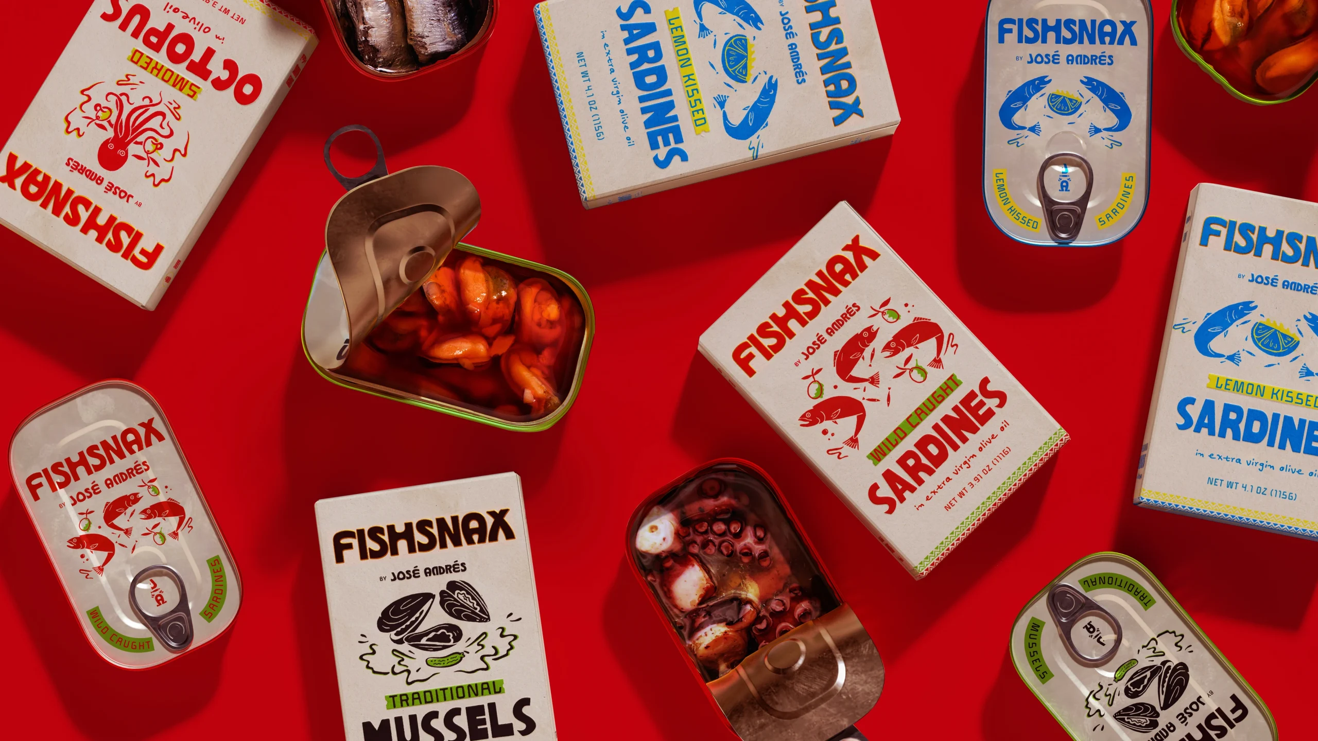
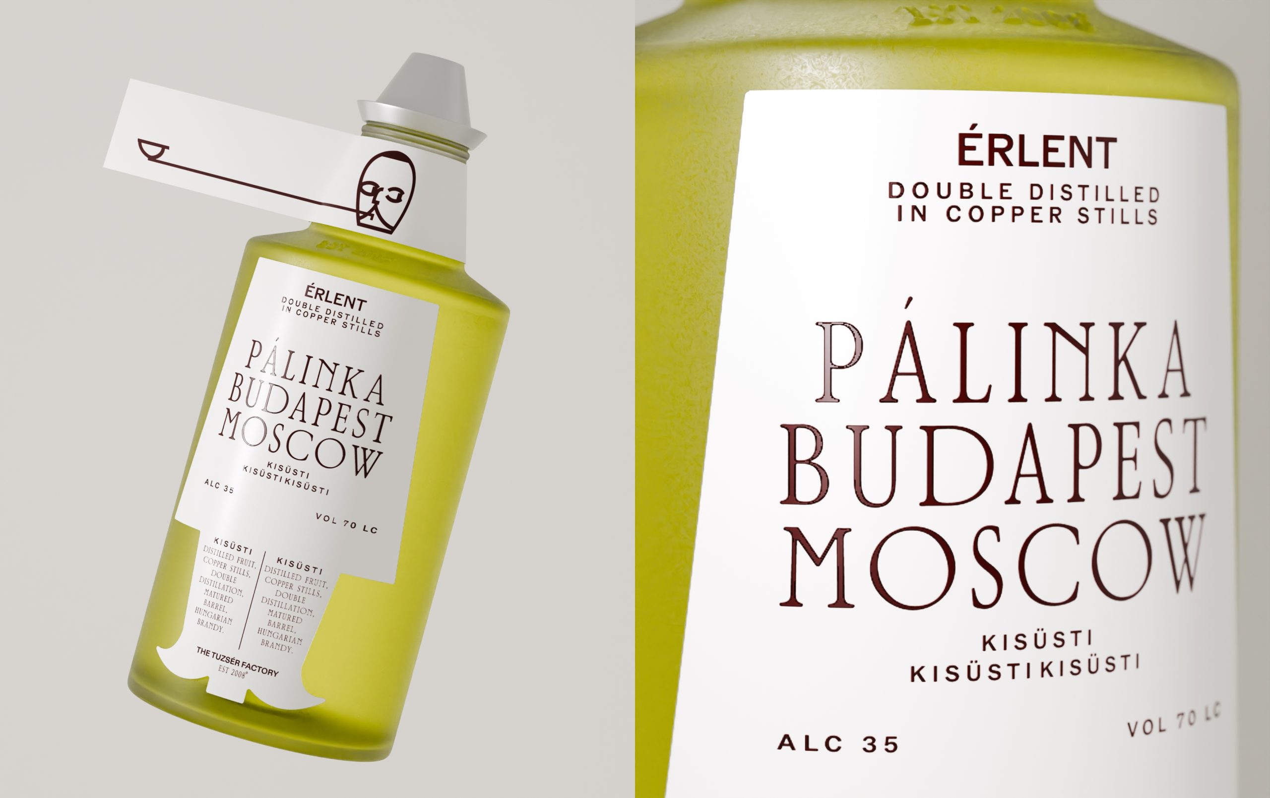
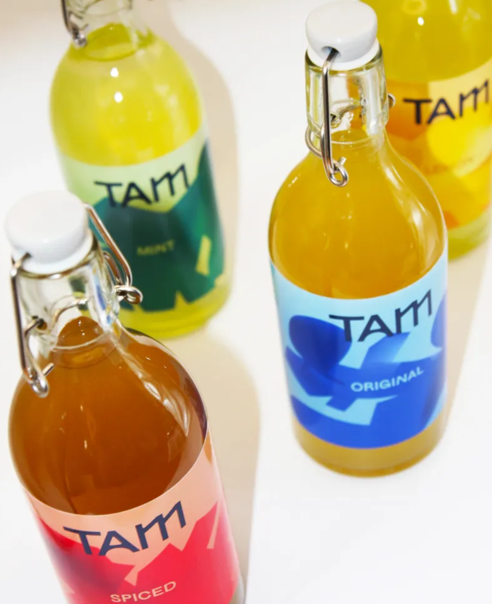
It’s friday which means we have a fresh round-up of concepts we wish were real! From Zuc Organic Juice to One Percent’s unconventional way of packaging shoes, we have collected a few of our favorite concept and student package designs! Have a great weekend!
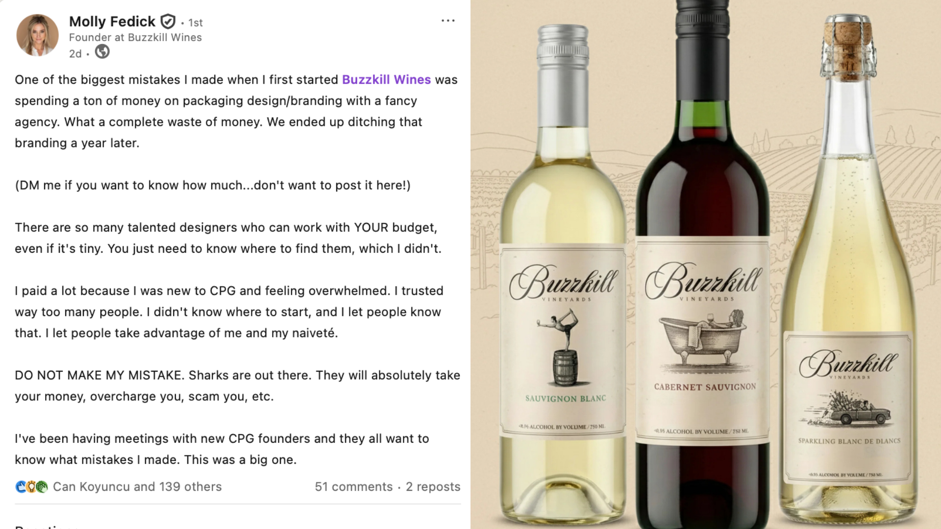
STUDENT