THIS IS IT! DIELINE Awards 2026 Late Entry Deadline Ends Feb 28
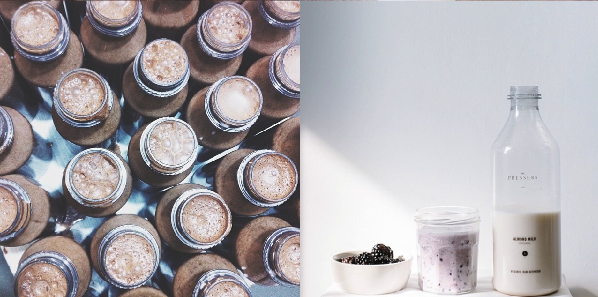
The Pressery was born out of the idea of bringing healthy organic foods to local communities. Their dairy and juices are packaged to encourage consumers to go back to the basics. The bottle’s design tributes traditional glass milk bottles with a contemporary restyle using plastic. Because the company’s focus is using clean ingredients, the brand uses a classic black and white palette that is minimally displayed on their packaging and can be found throughout their stationary.
“The first stage of the branding process, the identity and original product range are defined and launched. Branding for the new company was an exercise in complete minimalism to reflect the pure values of this unique hand-made product. No ingredients are used that aren’t required and as such there are no elements to the identity that aren’t absolutely necessary. The logo typography is a reworked, balanced version of Sabon LT paired with condensed Trade Gothic LT. Given space to breathe, the logotype always appears adequately padded by a sizeable negative space square; a visual metaphor that nothing is allowed to compromise the absolute simplicity and purity of the product.
Launched in spring 2014 the branding work has been showcased in Kinfolk, Monocle, Wallpaper and throughout the national press. The Pressery almond milk is now stocked in several leading UK organic grocery outlets and is still made by hand in small batches in East London.”
Get unlimited access to latest industry news, 27,000+ articles and case studies.
Have an account? Sign in


