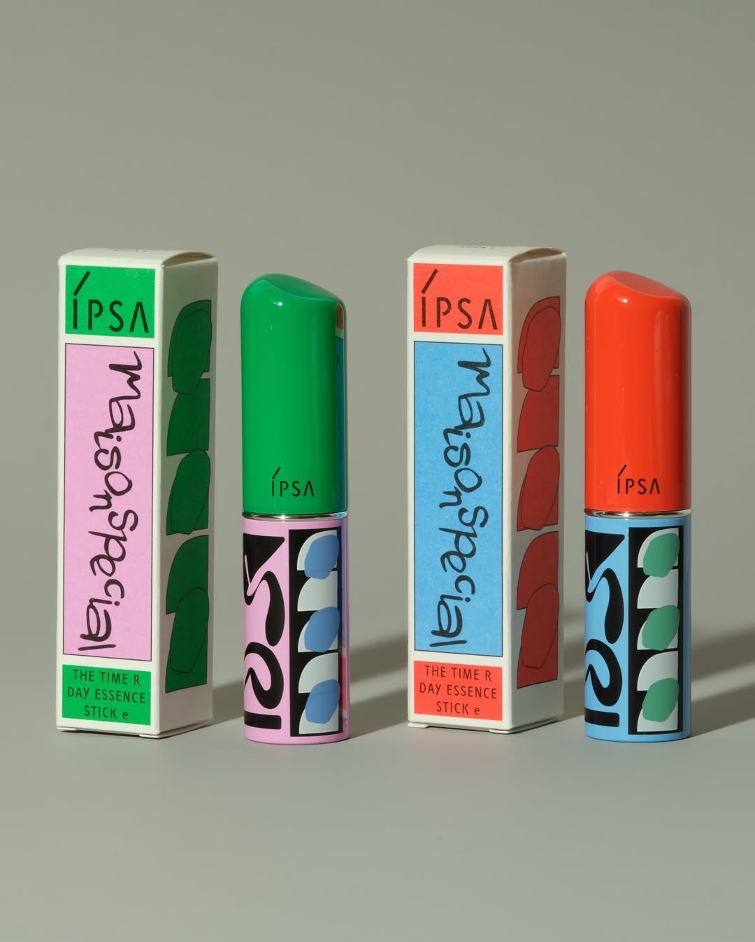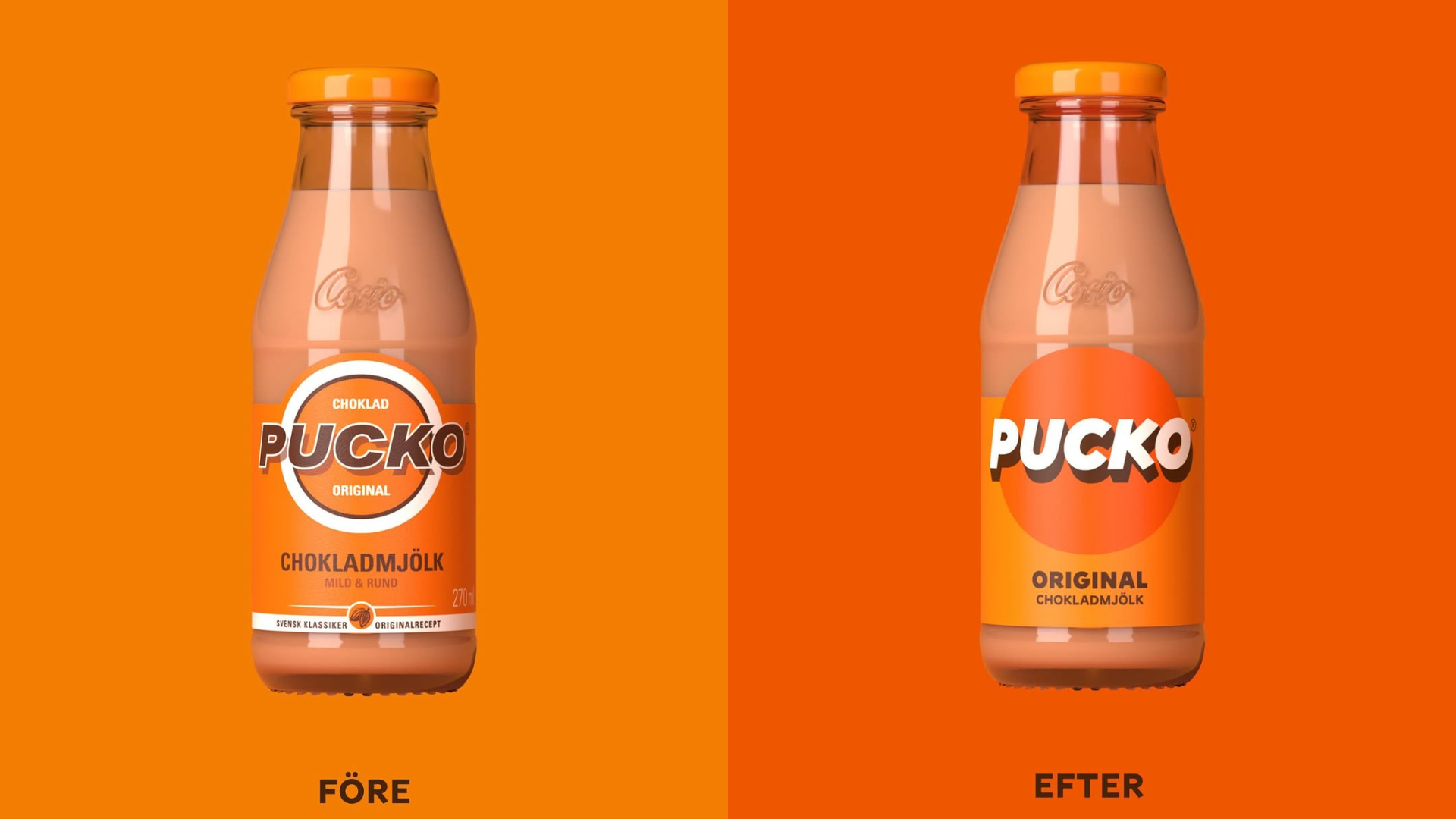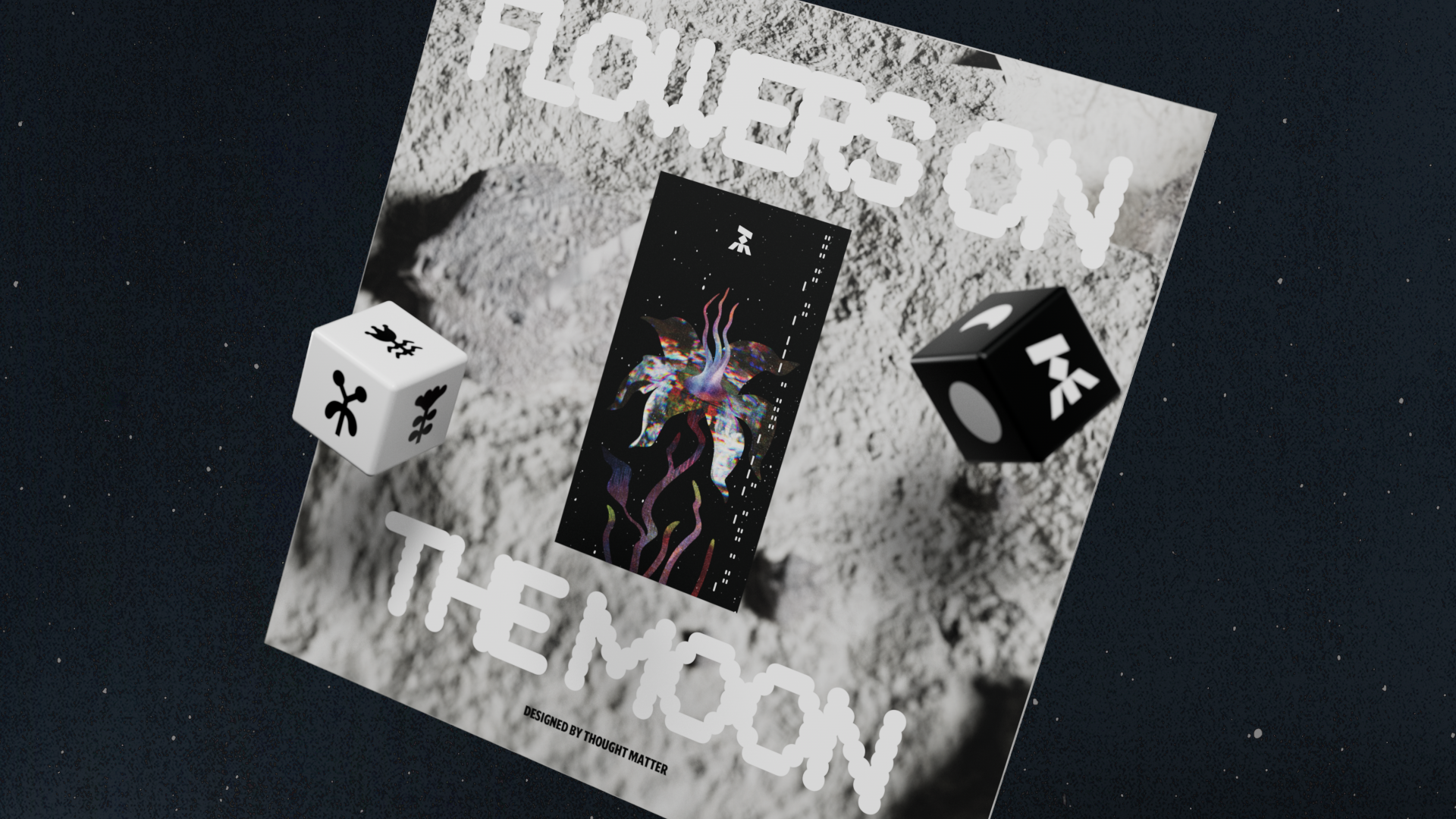

Function and simplicity are the hallmarks of Scandinavian design. It is arguably one of my favorite design aesthetics for no other reason than I love white rooms and the Scandinavians do the color white expertly. So much of the Scandinavian aesthetic is rooted in black and white that I wanted to do an exploration into the use of color. When is it used? How is it used? Is it subtle or bold?
When I think of Scandinavia, the colors I think of are white, green, and wood. I was happy to see a restrained use of color in this collection in Femme Natural Boost, Mäster Anders Beer, and Mack Isbjørn Beer. These brands employ color to act as a canvas to their brand logos.
I also loved the inverse use of color with projects that used it very lightly. In these projects, there is a heavy reliance on the contents to provide color, with few embellishment and copy.
